maggie manville
SoundTrip
UX/UI Designer | 15 Day Design Sprint Personal Project
Tech Stack: Figma
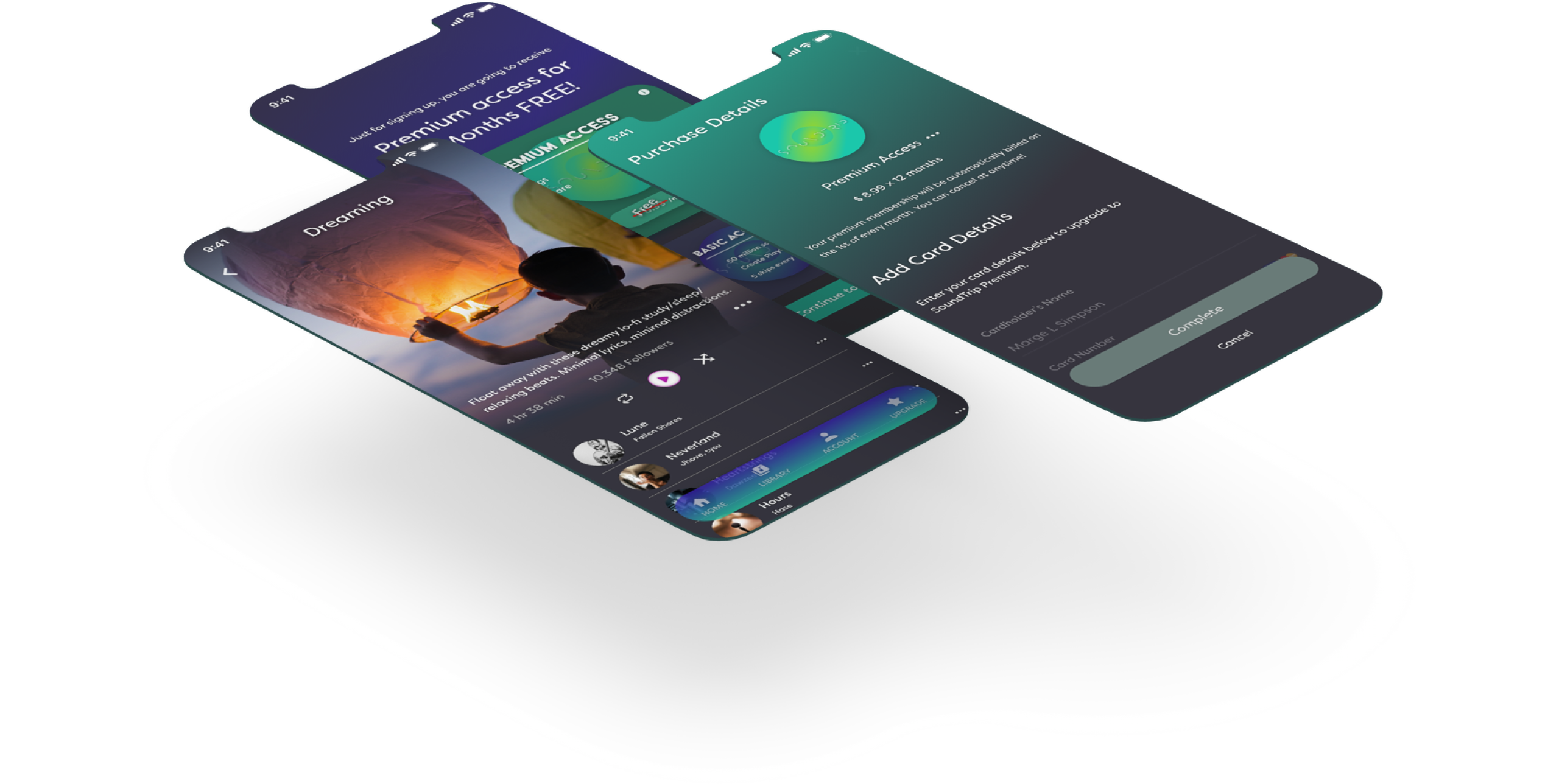
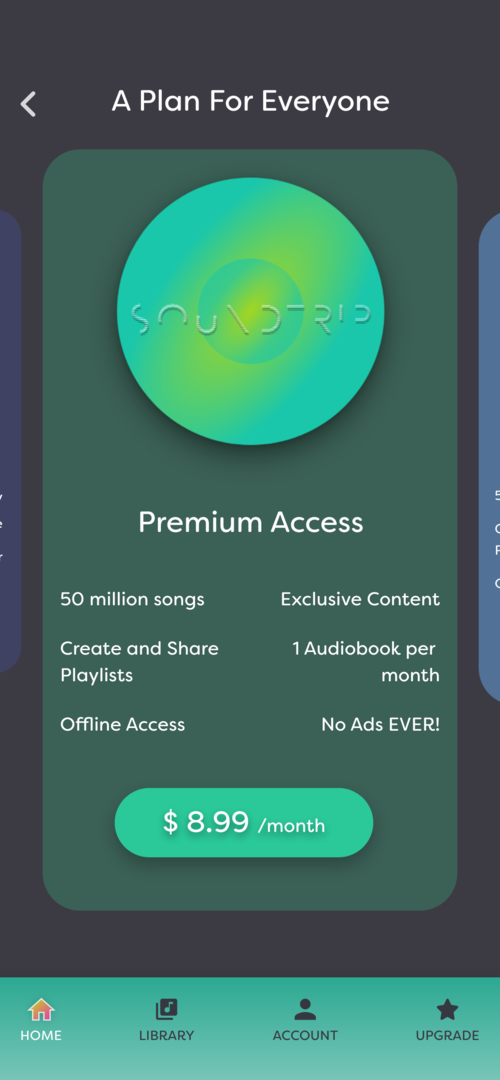
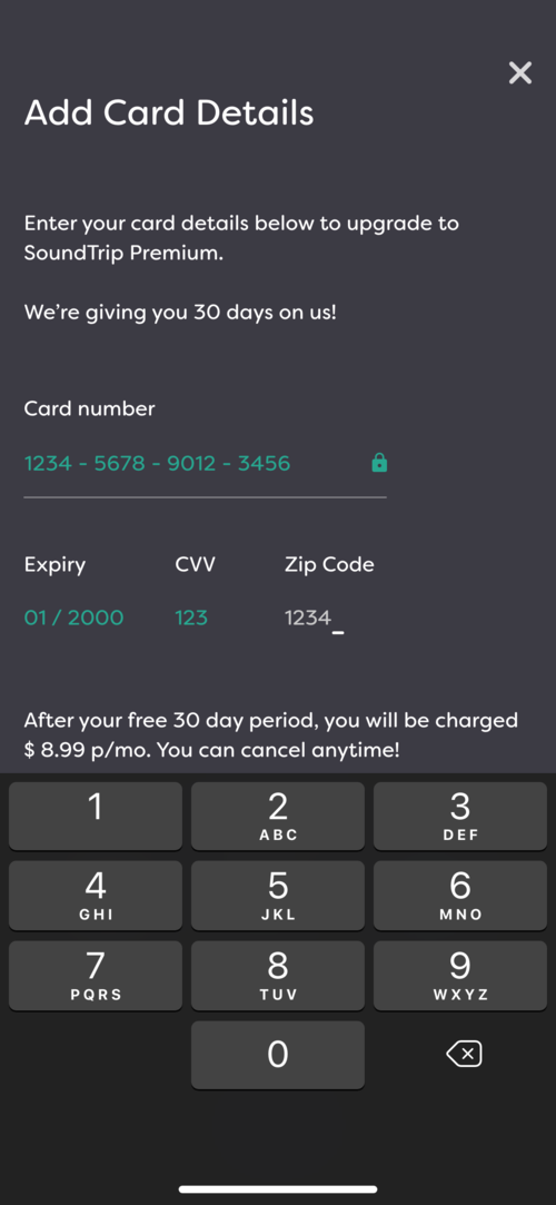
Freemium to Premium
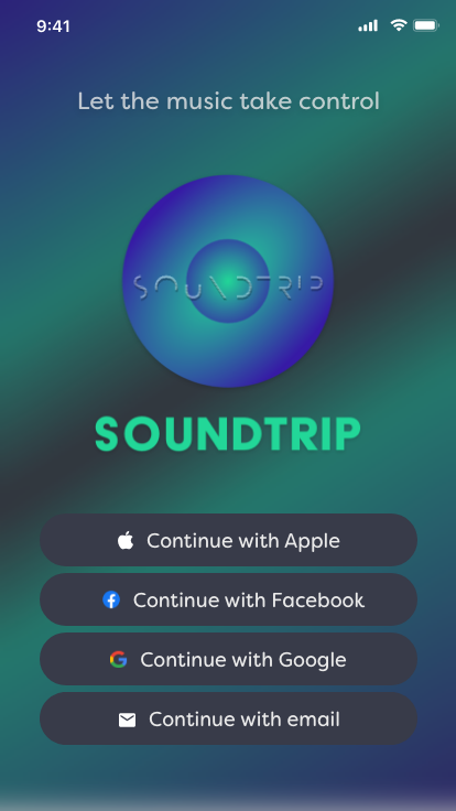
SoundTrip was a challenge to explore premium subscriptions for a previously free music streaming service. Aimed at 18-26-year-olds, I developed the brand identity, logo, and aesthetic to show how a visually appealing experience can enhance user enjoyment on an audio platform.
Solution
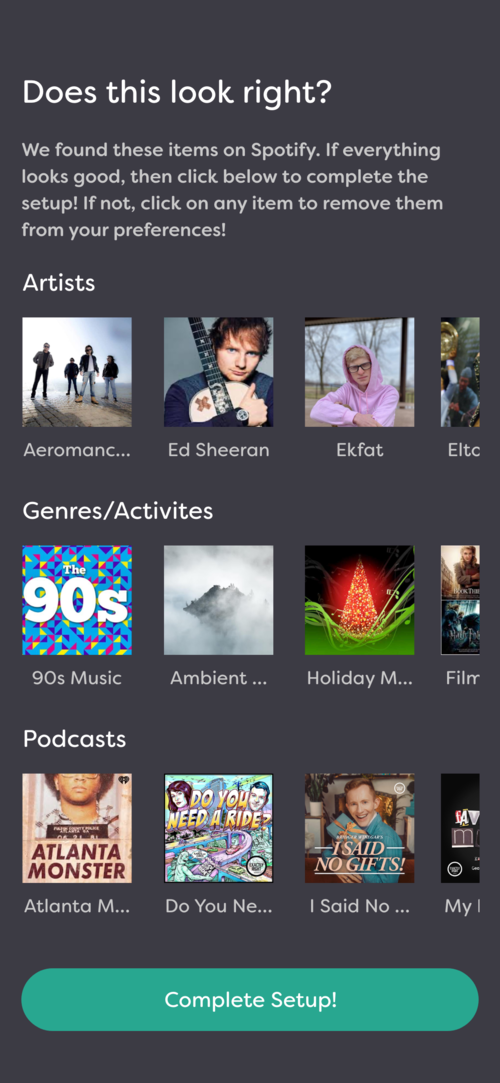
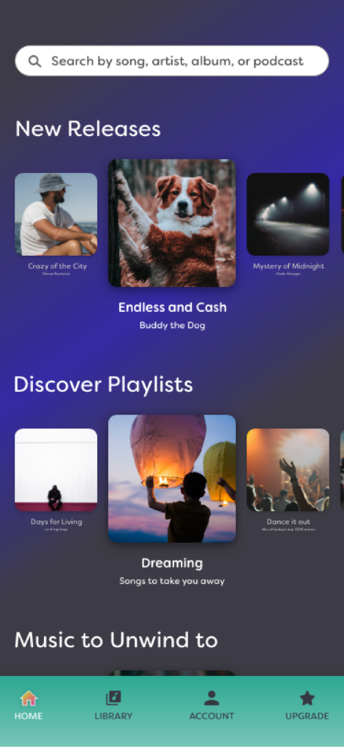
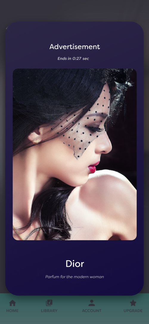
Create a friendly onboarding experience for new users with a free premium trial. Include an easy one-click upgrade in the app's navigation and engaging ads to boost user interaction.
Read Full Case Study →
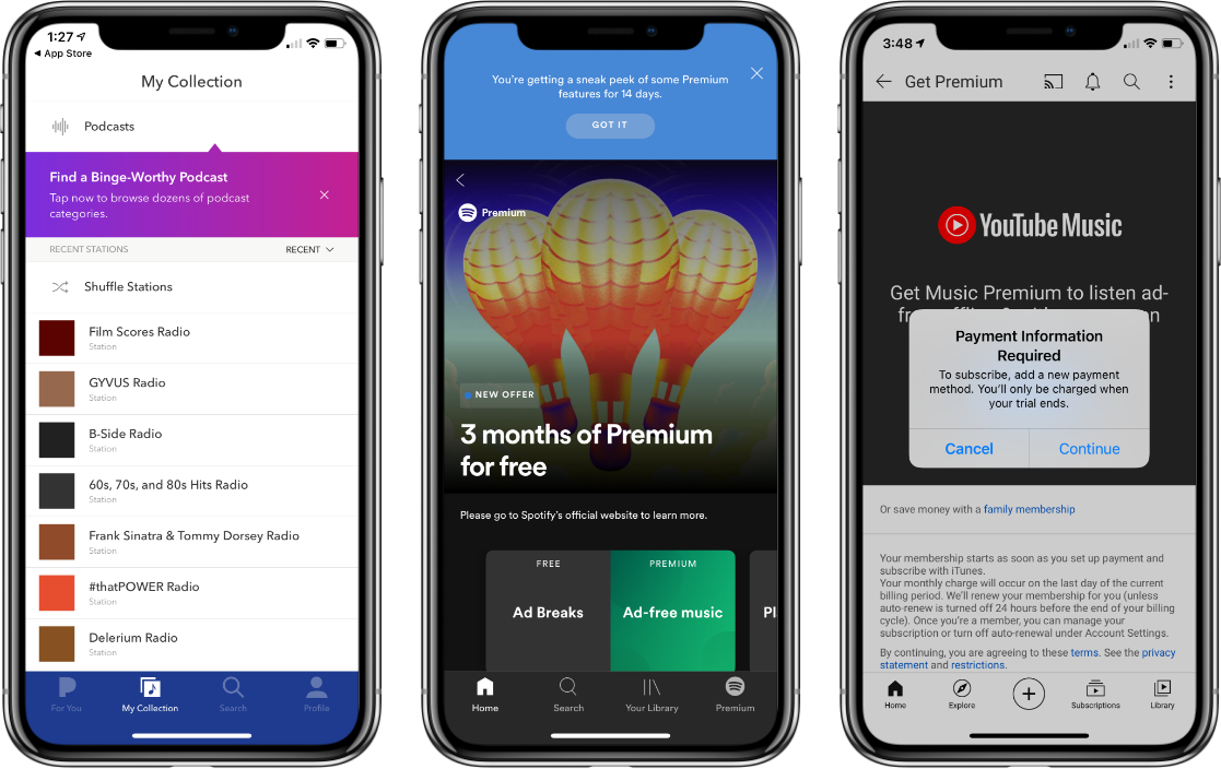
Research
Discovery/Designs
User Testing/Validation
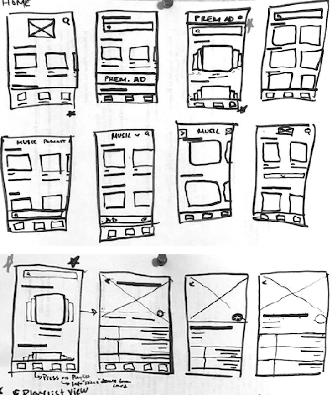
Iteration
Using the insight I gained from testing information, the next phase became about how the branding and company feel would come into play to meet the needs of Travis.
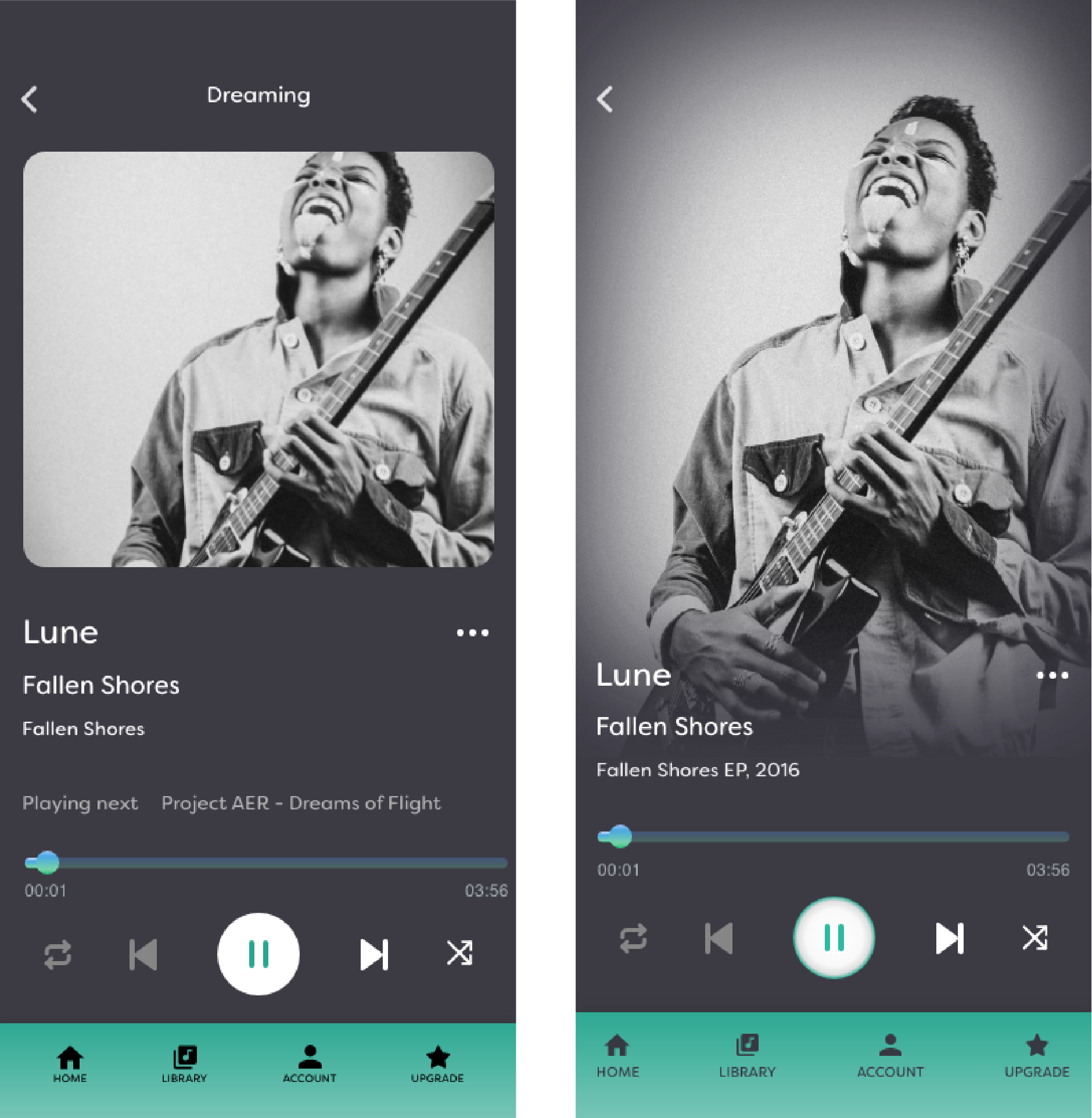
Final
Using the insight I gained from testing information, the next phase became about how the branding and company feel would come into play to meet the needs of Travis.
Final Thoughts
Accessibility Issues
There’s some MAJOR accessibility issues in this design with not only colors but how some interactions were proposed. Which brings me to my next thought...

Bottom Navigation Doesn’t Work
The navigation should just be kept native as my proposed interaction is a bit clunky and perhaps not worth the development time.

Interesting Ideas in Time Constraint
There’s a theory that people read in an F-shaped pattern, and that this should influence how you structure content on your website.
maggie manville
SoundTrip
UX/UI Designer | 15 Day Design Sprint Personal Project
Tech Stack: Figma
Freemium to Premium
SoundTrip was a challenge to explore premium subscriptions for a previously free music streaming service. Aimed at 18-26-year-olds, I developed the brand identity, logo, and aesthetic to show how a visually appealing experience can enhance user enjoyment on an audio platform.
Solution
Create a friendly onboarding experience for new users with a free premium trial. Include an easy one-click upgrade in the app's navigation and engaging ads to boost user interaction.
Read Full Case Study →
Research
Discovery/Designs
User Testing/Validation
Iteration
Using the insight I gained from testing information, the next phase became about how the branding and company feel would come into play to meet the needs of Travis.
Final
Using the insight I gained from testing information, the next phase became about how the branding and company feel would come into play to meet the needs of Travis.
Final Thoughts
Accessibility Issues
There’s some MAJOR accessibility issues in this design with not only colors but how some interactions were proposed. Which brings me to my next thought...
Bottom Navigation Doesn’t Work
The navigation should just be kept native as my proposed interaction is a bit clunky and perhaps not worth the development time.
Interesting Ideas in Time Constraint
Given the self-imposed time constraint, the exercise surfaced a lot of ideas and ultimately, looking back at it years later shows some ideas that are seen now in Spotify and apps looking to get users from the Spotify platform.