maggie manville
Logic-Driven Color Architecture
A foundation for driving flexibility and multi-brand scaling
Role: Lead Designer, Architect | 2024-25
Tech Stack: Figma


Modernize Color Library for SaaS Environment
Architect a scalable, token-driven color system that prioritizes perceptual accessibility and multi-client flexibility.
Legacy Library Integrating with Client Branding
By assigning colors based on their tonal value rather than just their lightness, I ensured that any color in the system would maintain a predictable contrast ratio.
Default


Perceptual Tones over Static Hexes
By assigning colors based on their tonal value rather than just their lightness, I ensured that any color in the system would maintain a predictable contrast ratio.
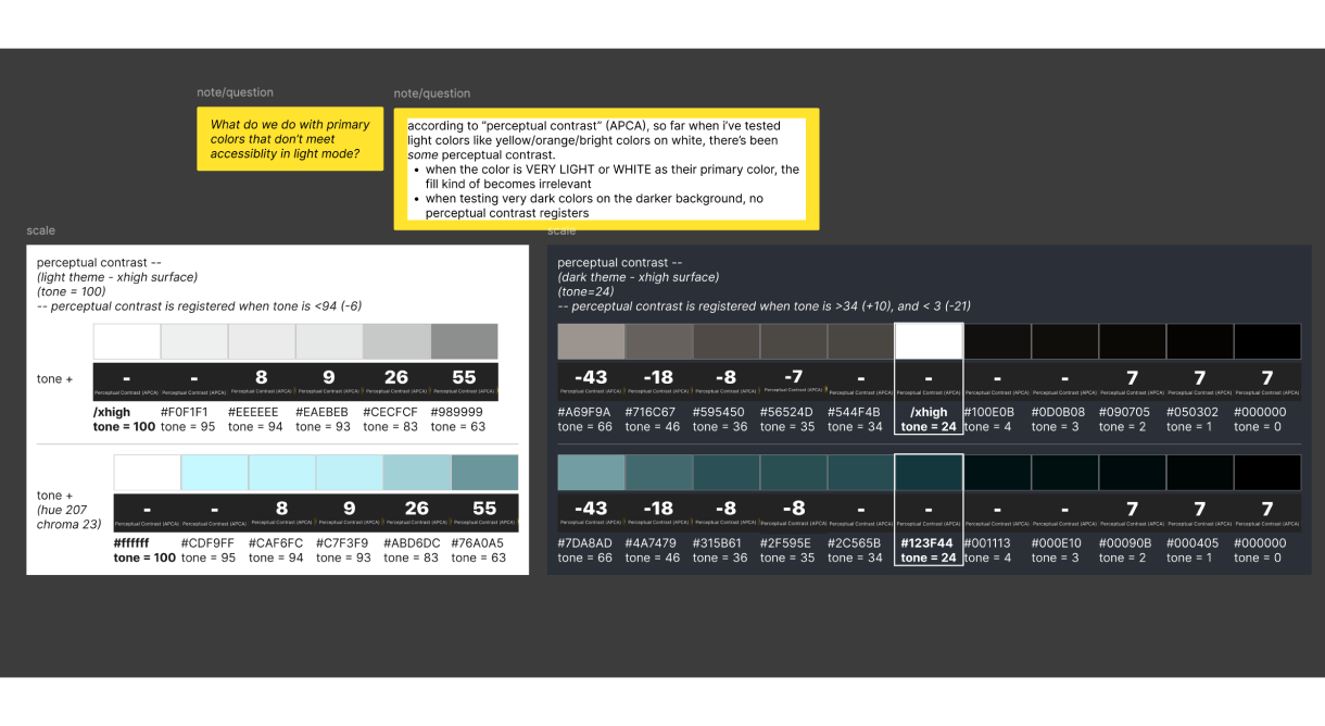
If a Neutral "Tone 80" passes accessibility against a Surface color, then a Brand "Tone 80" color will also pass.
System Integrity
We moved from "guessing at colors" to a logic-based taxonomy that ensures a cohesive user experience across all products.
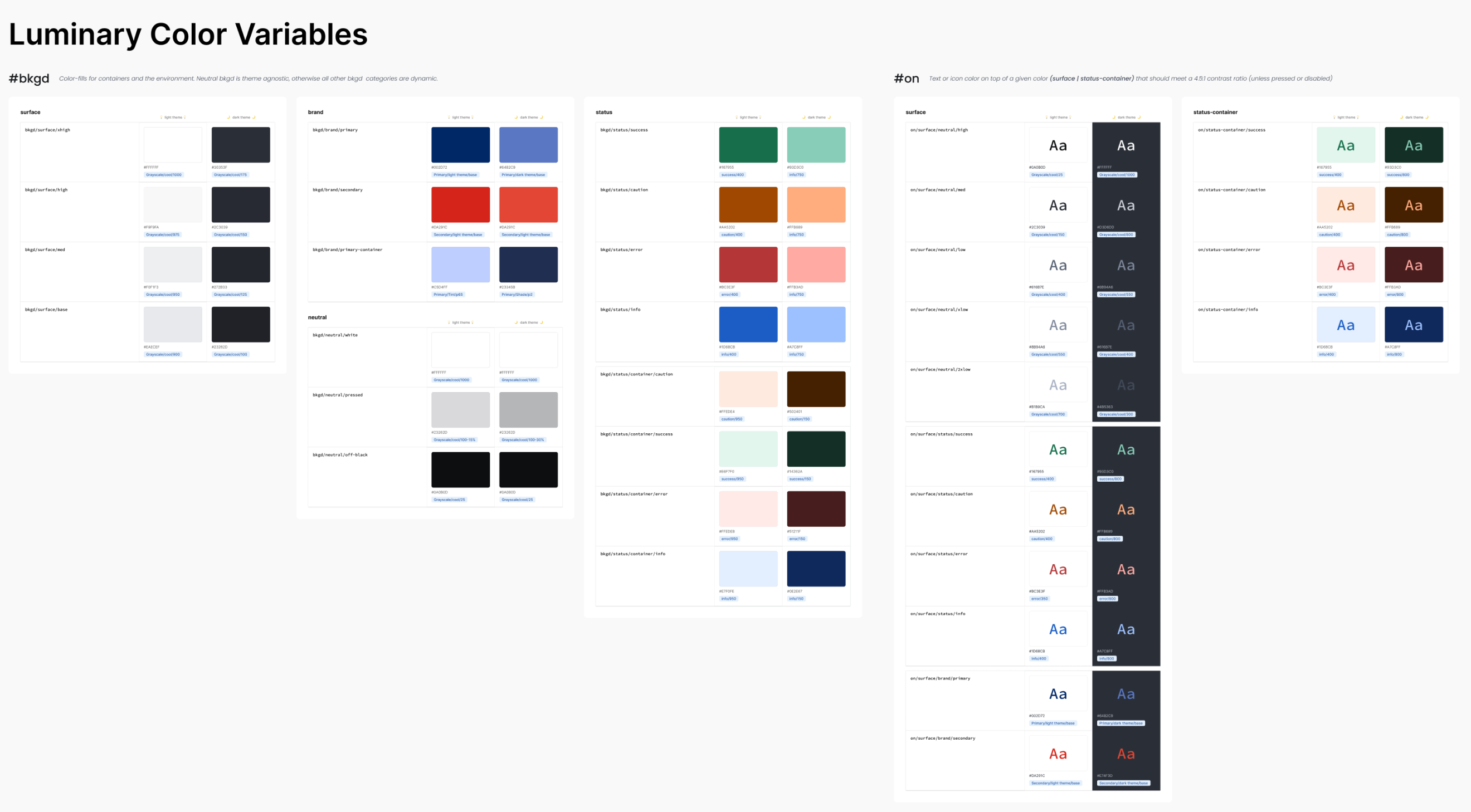
Symantic naming system for core token library based on what a color DOES versus what it is.
“bkgd.brand.primary” vs “blue.500”
Systemtized Logic to Build a Figma Plugin
Used as a design tool or to validate with stakeholders. Carries 1:1 parity with code, so there is no change in what color would be generated.
Based on the color logic built in the plugin:
- Any color can be selected and tested within the designs on the fly
- Dark theme is automatically generated based on the original color
- Can swap hex code within the “primary” token in Figma
- Show Contrast rating for light and dark themes
- If contrast ratio is not met, show the closest alternative HEX color that meets accessibility.
Final Thoughts

Problem-Evolved
By shifting from measuring accessibility based soley on HEX codes to a Perceptual Tonal Scale, I transformed our color system from a maintenance burden into a strategic asset. This architecture doesn't just solve today's accessibility issues—it provides a repeatable framework for onboarding new clients and brands.

Standardized Accessibility
Contrast ratios are now "baked in" to the tonal scale, reducing manual QA time
Themed Flexibility
The decoupled Alias layer allows for instant "dark mode" or brand-swapping without touching the core component logic.
maggie manville
Logic-Driven Color Architecture
A foundation for driving flexibility and multi-brand scaling
Role: Lead Designer, Architect | 2024-25
Tech Stack: Figma


Modernize Color Library for SaaS Environment
Architect a scalable, token-driven color system that prioritizes perceptual accessibility and multi-client flexibility.
Legacy Library Integrating with Client Branding
By assigning colors based on their tonal value rather than just their lightness, I ensured that any color in the system would maintain a predictable contrast ratio.
Default


Perceptual Tones over Static Hexes
By assigning colors based on their tonal value rather than just their lightness, I ensured that any color in the system would maintain a predictable contrast ratio.
If a Neutral "Tone 80" passes accessibility against a Surface color, then a Brand "Tone 80" color will also pass.
System Integrity
We moved from "guessing at colors" to a logic-based taxonomy that ensures a cohesive user experience across all products.
Symantic naming system for core token library based on what a color DOES versus what it is.
“bkgd.brand.primary” vs “blue.500”
Systemtized Logic to Build a Figma Plugin
Used as a design tool or to validate with stakeholders. Carries 1:1 parity with code, so there is no change in what color would be generated.
Based on the color logic built in the plugin:
- Any color can be selected and tested within the designs on the fly
- Dark theme is automatically generated based on the original color
- Can swap hex code within the “primary” token in Figma
- Show Contrast rating for light and dark themes
- If contrast ratio is not met, show the closest alternative HEX color that meets accessibility.
Final Thoughts
Problem-Evolved
By shifting from measuring accessibility based soley on HEX codes to a Perceptual Tonal Scale, I transformed our color system from a maintenance burden into a strategic asset. This architecture doesn't just solve today's accessibility issues—it provides a repeatable framework for onboarding new clients and brands.
Standardized Accessibility
Contrast ratios are now "baked in" to the tonal scale, reducing manual QA time
Themed Flexibility
The decoupled Alias layer allows for instant "dark mode" or brand-swapping without touching the core component logic.
maggie manville
Logic-Driven Color Architecture
A foundation for driving flexibility and multi-brand scaling
Role: Lead Designer, Architect | 2024-25
Tech Stack: Figma


Modernize Color Library for SaaS Environment
Architected a scalable, token-driven color system that prioritized perceptual accessibility and multi-client flexibility while accommodating light and dark themes. This automated accessibility based on client’s given primary colors--within our set environment.
Legacy Library Integrating with Client Branding
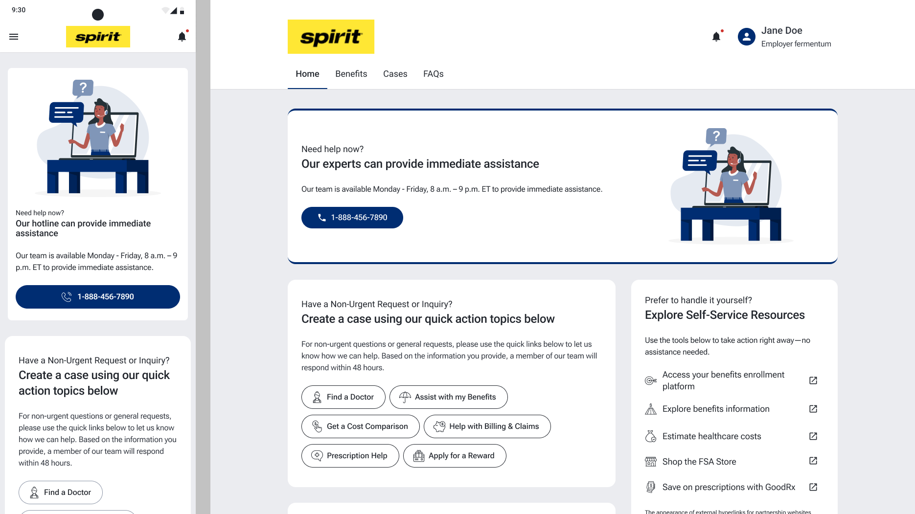
The problem we we trying to scale for was that clients were given the option of having their logo and our company’s colors as the ‘Default’ option or they could choose to have their “Brand” color as the primary color.
Default
Perceptual Tones over Static Hexes
By assigning colors based on their tonal value rather than just their lightness, I ensured that any color in the system would maintain a predictable contrast ratio.
If a Neutral "Tone 80" passes accessibility against a Surface color, then a Brand "Tone 80" color will also pass.
System Integrity
We moved from "guessing at colors" to a logic-based taxonomy that ensures a cohesive user experience across all products.
Symantic naming system for core token library based on what a color DOES versus what it is.
“bkgd.brand.primary” vs “blue.500”
Systemized Logic to Build a Figma Plugin
Used as a design tool or to validate with stakeholders. Carries 1:1 parity with code, so there is no change in what color would be generated.
Based on the color logic built in the plugin:
- Any color can be selected and tested within the designs on the fly
- Dark theme is automatically generated based on the original color
- Can swap hex code within the “primary” token in Figma
- Show Contrast rating for light and dark themes
- If contrast ratio is not met, show the closest alternative HEX color that meets accessibility.
Final Thoughts
Problem-Evolved
By shifting from measuring accessibility based only on HEX codes to a Perceptual Tonal Scale, and identifying breakpoints against our environment, I transformed our color system from a maintenance burden into a strategic asset. This architecture provides a repeatable framework for onboarding new clients and brands.
Standardized Accessibility
Contrast ratios are now "baked in" to the tonal scale, reducing manual QA time
Themed Flexibility
The decoupled Alias layer allows for instant "dark mode" or brand-swapping without touching the core component logic.