Establishing a Multi-Platform Design System Architecture
Unifying Mobile App + In-Vehicle Through Semantic Token Structure
Role:
Contributing Designer
Timeline:
April 2022 - June 2023
Tools:
Figma, Sketch, Abstract, InVision+ DSM
Outcome:
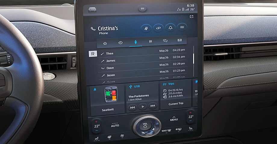
Ground-up design system (Mobile App and In-Vehicle) rebuild leading to platform unification while consolidating to a single tool (Figma), with an emphasis on design tokens to ease development constraints across platforms. The team would go on to present our rebuild at the June 2023 Config Conference having gotten early access to the “variable” feature in Figma. They advanced this work to production, shipping in FordPass mobile and Lincoln in-vehicle displays in 2025.
Variable Color Naming + Usage
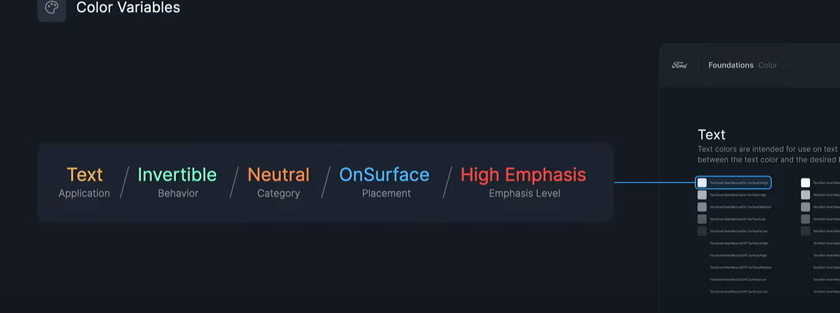
Our 2.0 system used color-based token names (e.g., 'Blue-500'), which created confusion during handoff—engineers couldn't tell if a token should change per theme or stay constant. I advocated for semantic naming based on function, not appearance, so token names told engineers exactly what the color did and when it changed.
Wanting to continue to stay scalable, we broke down the names in the following way:
- Application (Text, icon, stroke, fill, etc)
- Behavior (Does it change between themes)
- Color Category (Neutral, Primary Color, Status, etc)
- Placement (Is it on top of a surface color?)
- Emphasis Level (Applied t-shirt scaling method)
Color Exploration
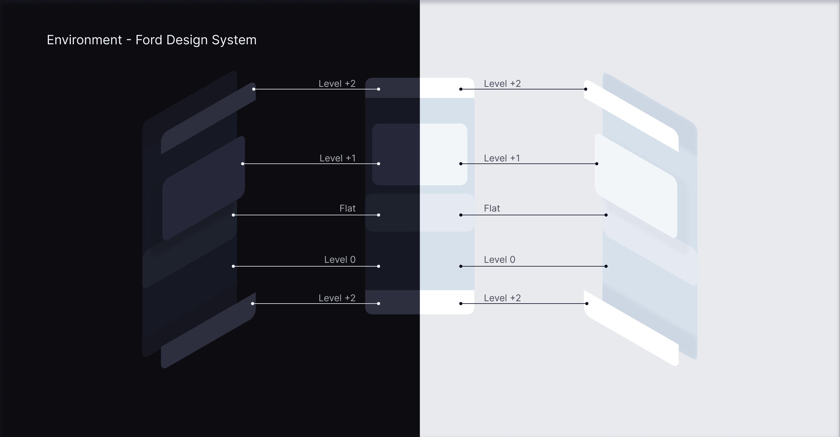
We needed to create an accessible color library that was 1:1 across brands, platforms, and themes.
So we established an environmental concept rooted in a light source positioned above the phone screen. This concept also integrated certain colors from the in-vehicle design that had been established in their initial version that utilized color opacities in order to emphasize their importance.
Accessibility Validation Methodology
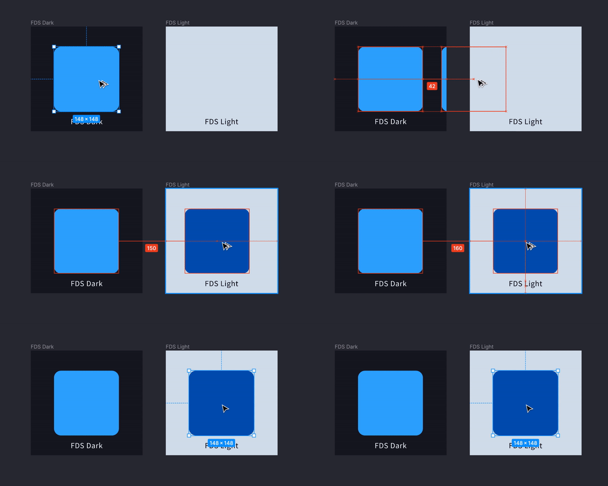
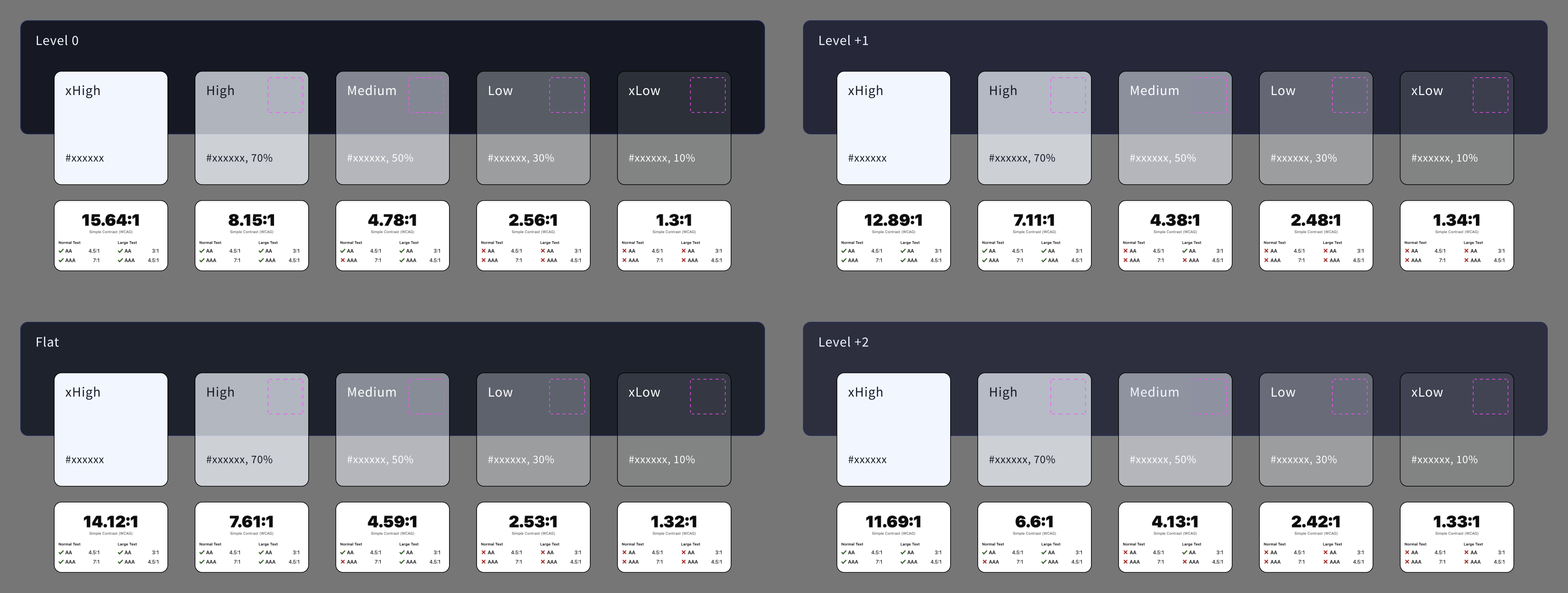
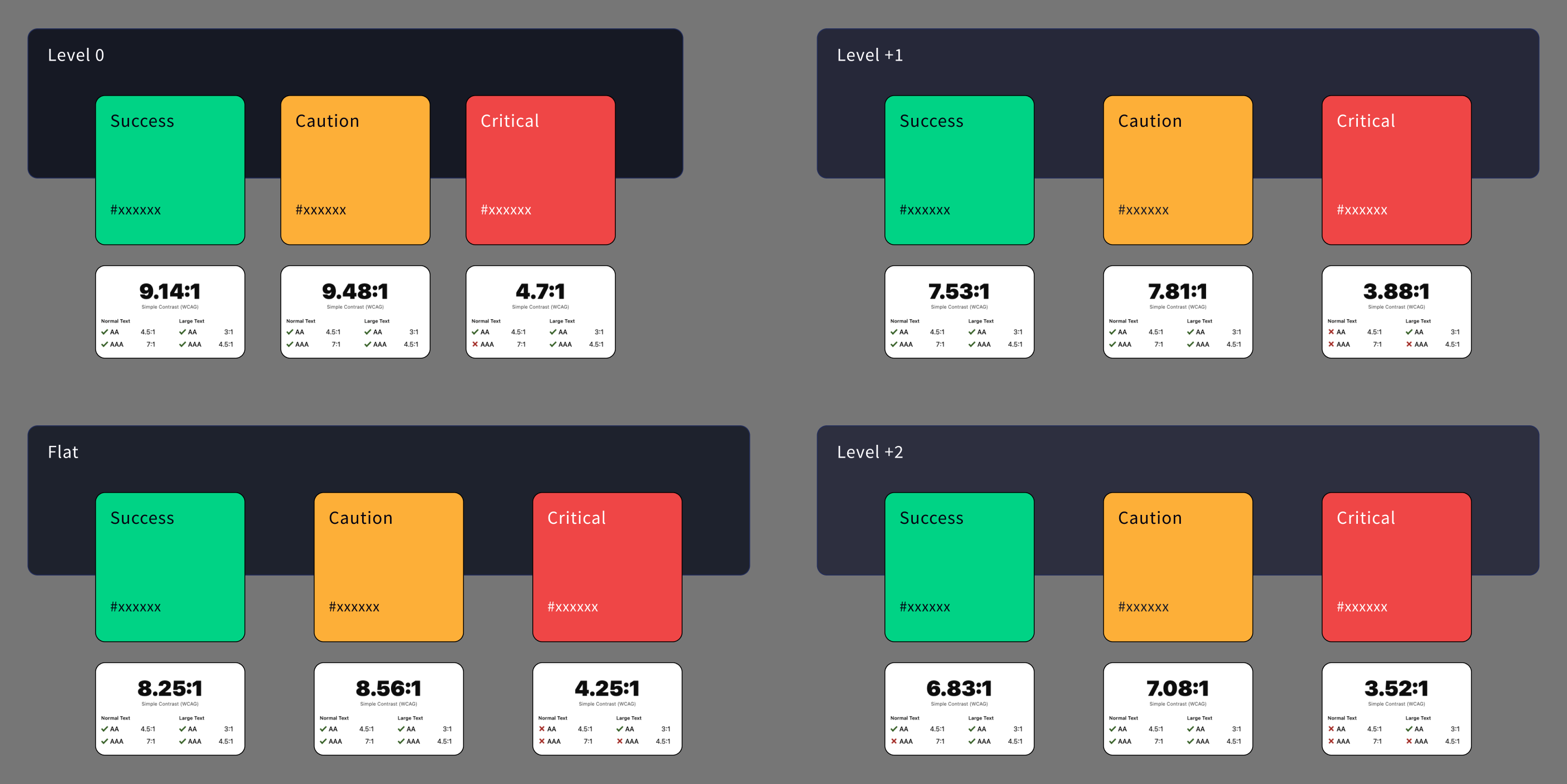
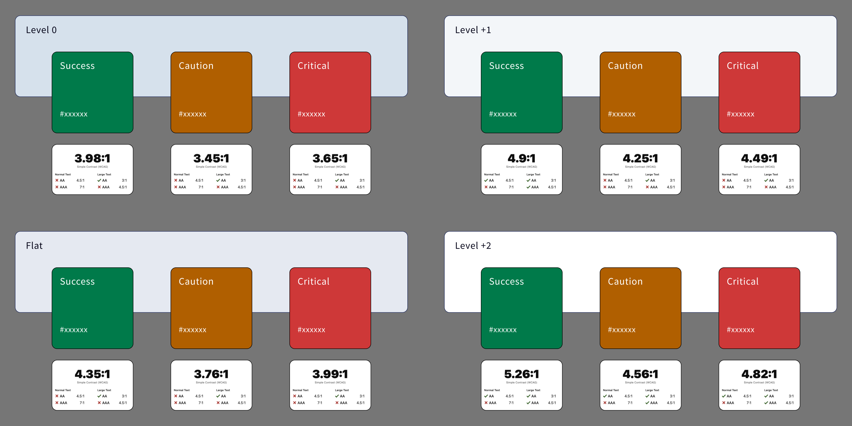
To determine which color combinations met WCAG AA standards (3.0:1 for normal text, 4.5:1 for small text), I created testable component states that placed candidate colors against real backgrounds. This methodology allowed the team to collaboratively decide which colors were acceptable across brands, platforms, and themes.
Exploring Modular Component Builds
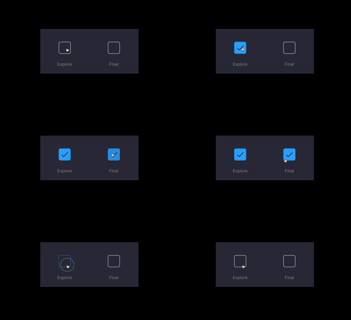
In the foundation workshop, we established a core principle: convey environmental dimensionality through component state (hover, active, focus) rather than visual affordances like shadows. This principle needed to work consistently across all components—buttons, navigation, inputs, etc.I explored this approach with checkboxes.
By tying visual depth to existing state logic, we created a pattern that:
- Reduced CSS complexity: No shadow variables to maintain per theme
- Scaled across components: Any component using :hover / :active / :focus automatically conveyed depth
- Worked across platforms: Mobile and in-vehicle rendering both support state-based styling without additional overhead
This principle became the foundation for how all interactive components would signal dimensionality.
Exploratory vs Final Iteration
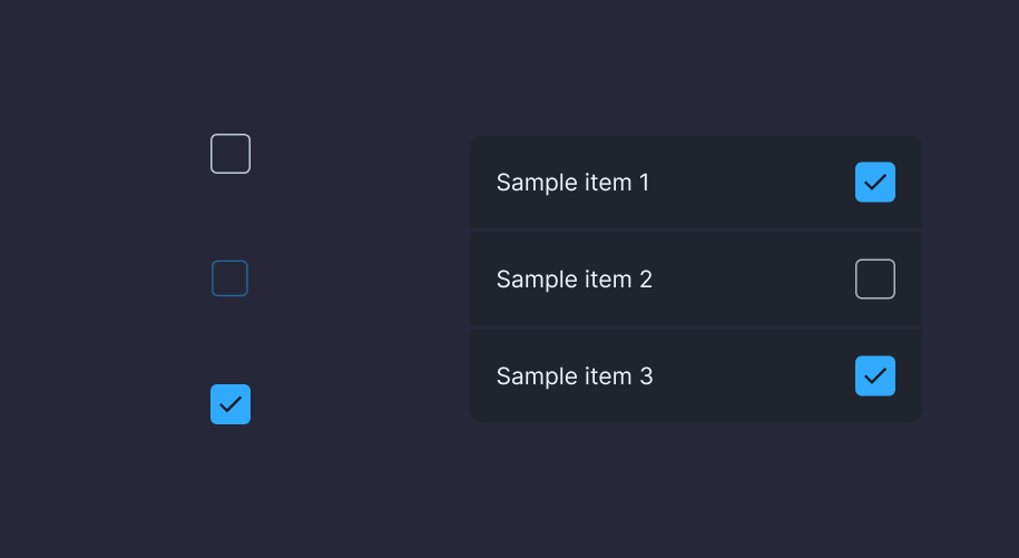
Final checkbox build - checkbox incorporated into list component
Navigation
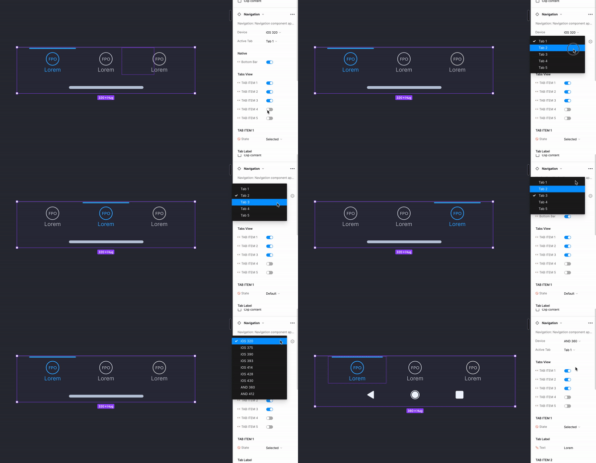
Following the workshop, the component that I delivered for the weekly stakeholder review was the navigation. I thought it was important to keep the navigation simple, but equally important in this initial iteration to keep the pillar labels beneath.This was a simple way to reinforce the user’s decisions, sense of place, and reinforce accessibility efforts.
Flexibility with Components
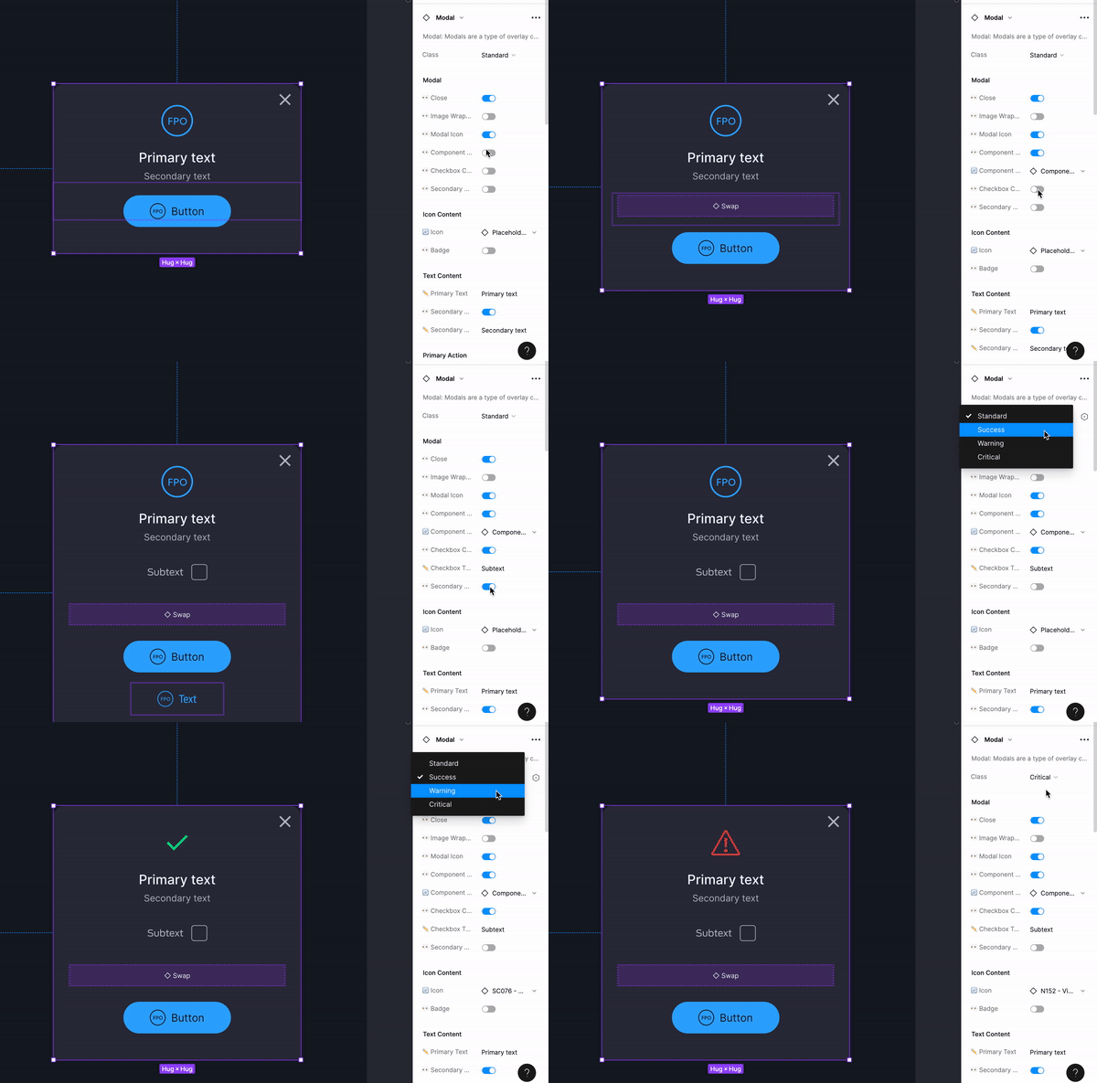
Figma’s properties allowed us the ability to level up the component’s flexibility that we could build into the component. This would enable quicker iteration and prototyping for product teams.
Design System Guidelines
Research | Information Architecture | Component Building
As a group we brainstormed and iterated on an initial structure of how the guidelines may look. Our ultimate goal was to have a website that housed our new guidelines, but in the mean time, we decided to structure and link to pages within Figma, mimicking a website.
While the team built out the rest of the finalized components, I began working through building out and populating the component guidelines and documentation.
Structuring Our House
We drew inspiration from existing design systems like, Material Design, HIG, Lightning, Carbon, and Spectrum. We also had a lot of learnings from our previous experience with the InVision DSM and had many pain points.
Our goal was to address these pain points (below) and create an efficient and user-friendly system for designing and developing components and guidelines.
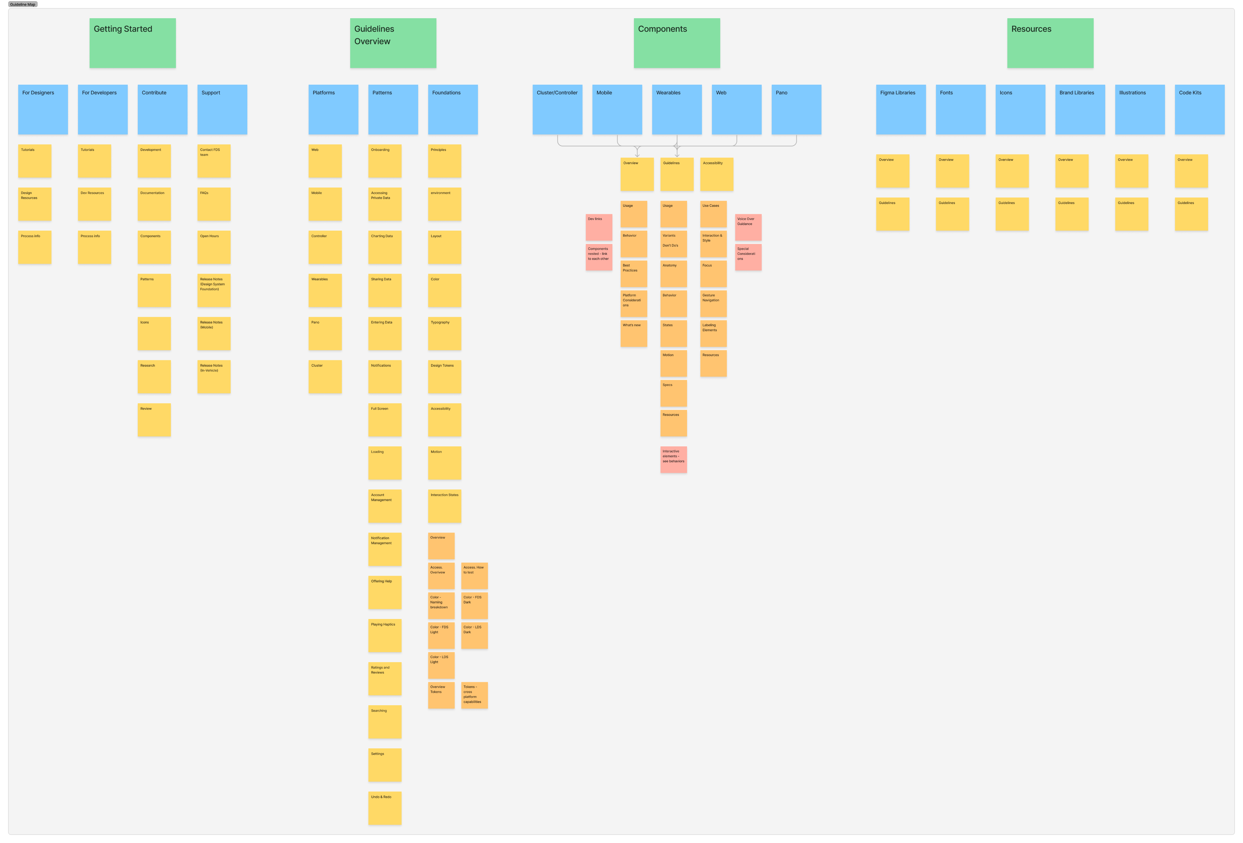
Difficult to navigate
- No internal page navigation = a lot of scrolling
- “cmd + f” did not always work to find items much farther down the page)
- Difficultly/Intimidating --> Avoid use by designers & devs
A lot of manual updates = time consuming
- Time consuming to update menial items (Figma solve-components update with library update)
- Images had to be used - higher likelihood of out dated version (Less but not eliminated with Figma)
Dev difficulties:
- Inspect links take them out of DSM (Figma solve - Inspect/Dev Mode)
- Cannot see component behavior
- High probability of viewing out of date version (Figma solve-simple update library automatically triggered)
Navigating Components
Because we had our sights set on creating a completely connected system, we wanted app/mobile designers to have access to see in-vehicle, web, and wearables in one spot, but not have to wade through all of the other items if they did not want to see them.
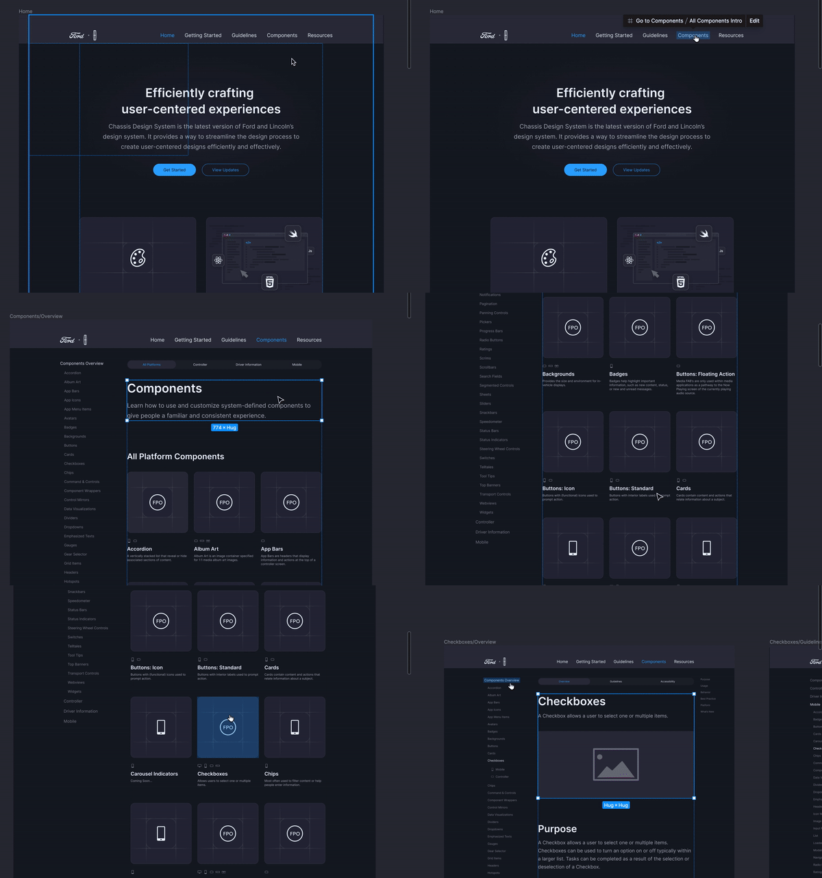
Navigating All Platform Components
Top navigation would always lead to all FDS Platform components landing page. Navigating using the ‘Components Overview’ from this page brings the user to the selected component overview.
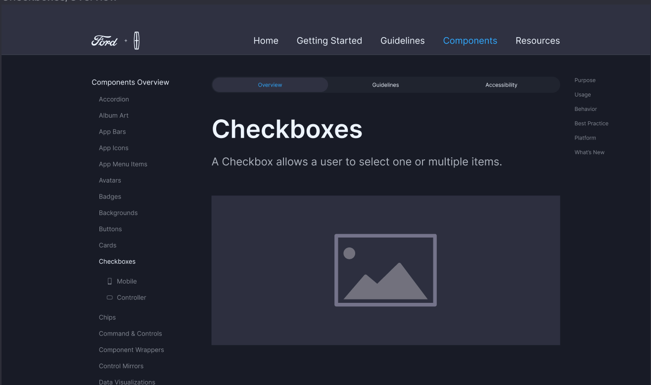

Nested Platform Navigation
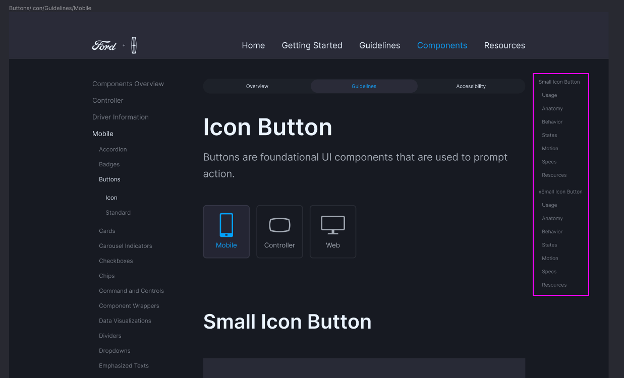
Intra-page navigation
Accessibility Guidelines
I also added documentation to the guidelines specifically for developers around accessibility based on the component and also considerations for Android vs iOS experiences, as they have different requirements.
These were very much in progress by the time I departed, however I felt it important to highlight.
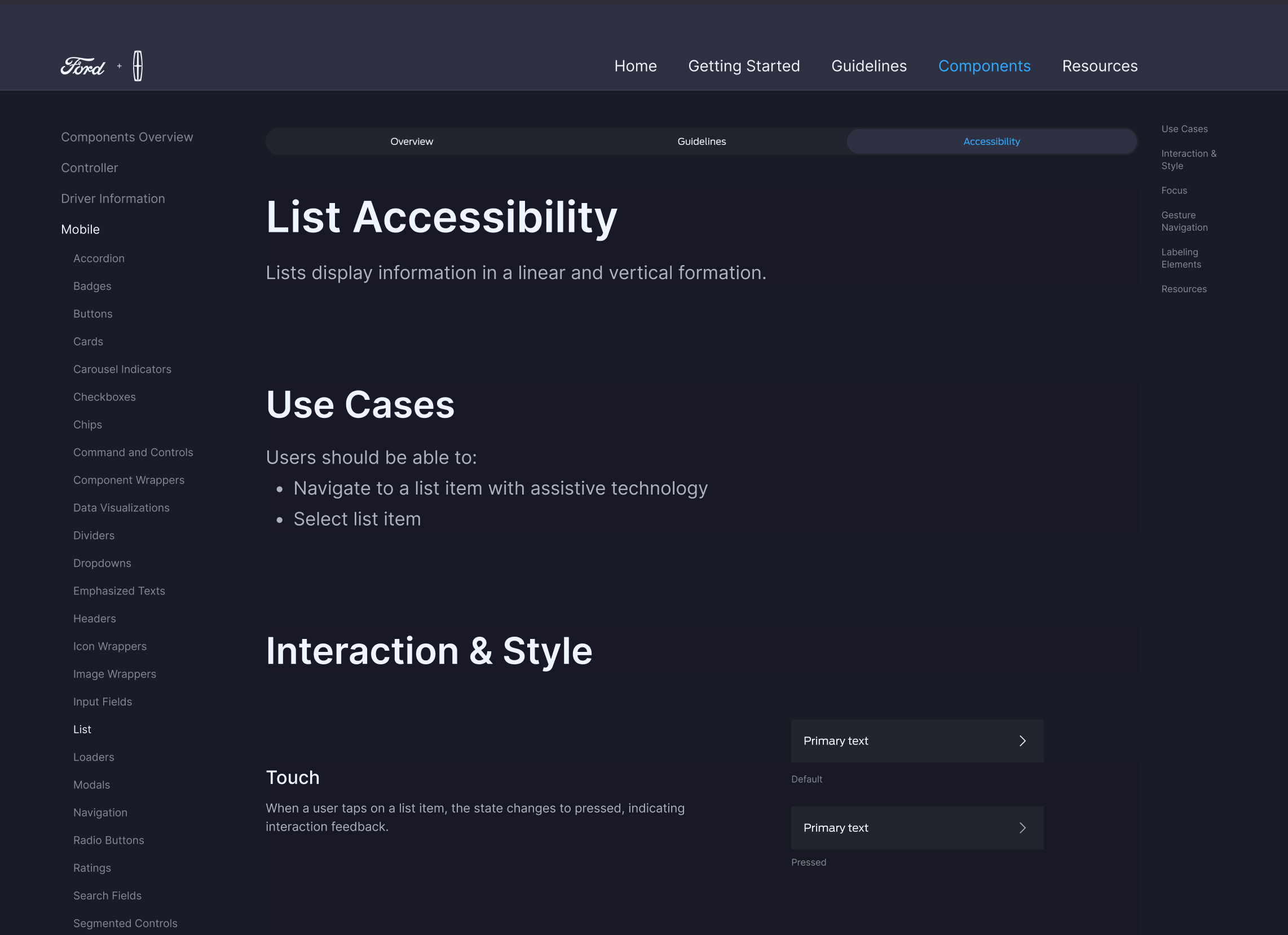
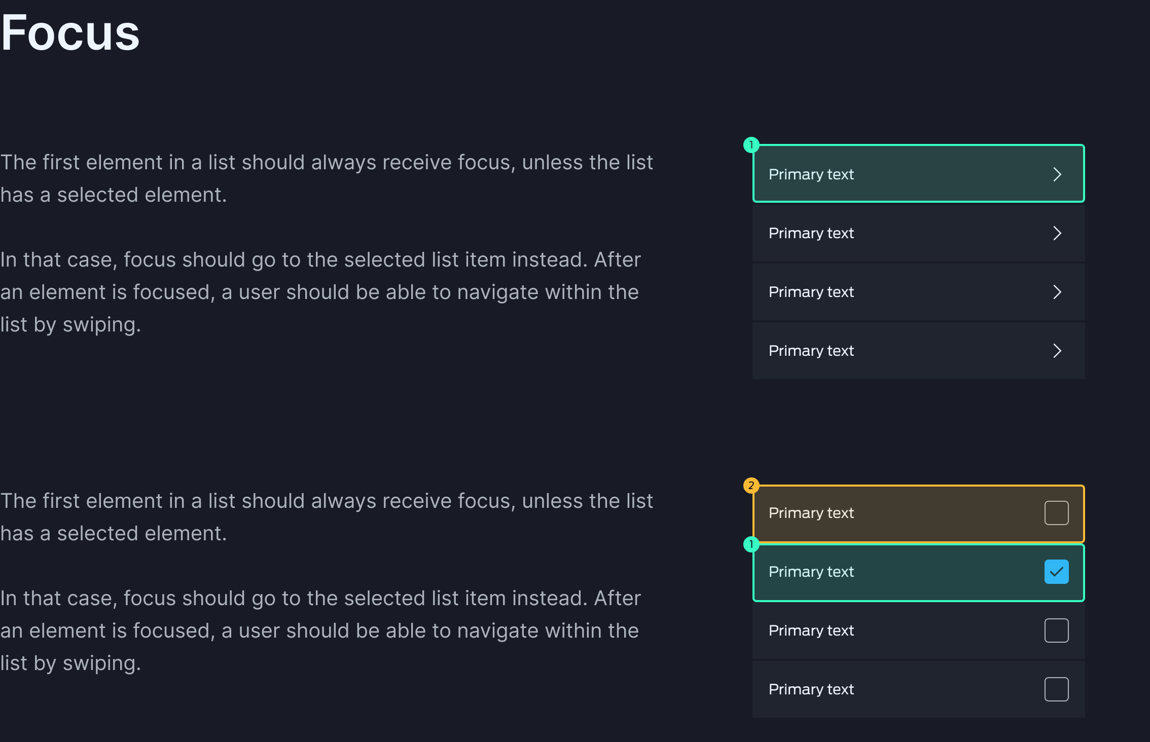
Example from the List Component focus order accessibility requirements for developers.
Final Thoughts

Career Trajectory
Having never experienced a complete ground-up design system build, establishing the semantic token naming structure, accessibility validation methodology, and guidelines information architecture taught me how systems thinking compounds across teams.
Though I departed before the Figma migration and production shipping, seeing the system launch in FordPass and Lincoln validated that the token architecture and naming conventions I developed were sound and scalable. This work sparked a real interest in design systems—specifically how design tokens are the translation layer where design intent meets engineering implementation—flexible enough that designers can iterate and engineers can optimize without losing alignment. I'm committed to continuing this journey in roles where I can see systems through to production.

Manual Updates, less but not elimitated.
We tried to keep static images to a minimum, they were still present. With the table components that I built for the guidelines, interaction with system components (up-to date) was possible in preview mode. GIFs were still being utilized for glanceable behavior, but could be seen in preview mode.
Support
Design systems are a living and evolving SYSTEM. They need people and support to work on them, maintain them, and continue to iterate on them to push them forward.
At the time of this implementation as a design system team, we were operating as team of three, which included myself, the Lead App Designer, and the Lead In-Vehicle Designer, which is laughable for as large of an organization that we were working for. So despite the circumstances, we did incredible work and I am so proud that I was able to be part of that team.
Establishing a Multi-Platform Design System Architecture
Unifying Mobile App + In-Vehicle Through Semantic Token Structure
Role:
Contributing Designer
Timeline:
April 2022 - June 2023
Tools:
Figma, Sketch, Abstract, InVision+ DSM
Outcome:
Ground-up design system (Mobile App and In-Vehicle) rebuild leading to platform unification while consolidating to a single tool (Figma), with an emphasis on design tokens to ease development constraints across platforms. The team would go on to present our rebuild at the June 2023 Config Conference having gotten early access to the “variable” feature in Figma. They advanced this work to production, shipping in FordPass mobile and Lincoln in-vehicle displays in 2025.
Variable Color Naming + Usage
Our 2.0 system used color-based token names (e.g., 'Blue-500'), which created confusion during handoff—engineers couldn't tell if a token should change per theme or stay constant. I advocated for semantic naming based on function, not appearance, so token names told engineers exactly what the color did and when it changed.
Wanting to continue to stay scalable, we broke down the names in the following way:
- Application (Text, icon, stroke, fill, etc)
- Behavior (Does it change between themes)
- Color Category (Neutral, Primary Color, Status, etc)
- Placement (Is it on top of a surface color?)
- Emphasis Level (Applied t-shirt scaling method)
Color Exploration
We needed to create an accessible color library that was 1:1 across brands, platforms, and themes.
So we established an environmental concept rooted in a light source positioned above the phone screen. This concept also integrated certain colors from the in-vehicle design that had been established in their initial version that utilized color opacities in order to emphasize their importance.
Accessibility Validation Methodology
To determine which color combinations met WCAG AA standards (3.0:1 for normal text, 4.5:1 for small text), I created testable component states that placed candidate colors against real backgrounds. This methodology allowed the team to collaboratively decide which colors were acceptable across brands, platforms, and themes.
Exploring Modular Component Builds
In the foundation workshop, we established a core principle: convey environmental dimensionality through component state (hover, active, focus) rather than visual affordances like shadows. This principle needed to work consistently across all components—buttons, navigation, inputs, etc.I explored this approach with checkboxes.
By tying visual depth to existing state logic, we created a pattern that:
- Reduced CSS complexity: No shadow variables to maintain per theme
- Scaled across components: Any component using :hover / :active / :focus automatically conveyed depth
- Worked across platforms: Mobile and in-vehicle rendering both support state-based styling without additional overhead
This principle became the foundation for how all interactive components would signal dimensionality.
Exploratory vs Final Iteration
Final checkbox build - checkbox incorporated into list component
Navigation
Following the workshop, the component that I delivered for the weekly stakeholder review was the navigation. I thought it was important to keep the navigation simple, but equally important in this initial iteration to keep the pillar labels beneath.This was a simple way to reinforce the user’s decisions, sense of place, and reinforce accessibility efforts.
Flexibility with Components
Figma’s properties allowed us the ability to level up the component’s flexibility that we could build into the component. This would enable quicker iteration and prototyping for product teams.
Design System Guidelines
Research | Information Architecture | Component Building
As a group we brainstormed and iterated on an initial structure of how the guidelines may look. Our ultimate goal was to have a website that housed our new guidelines, but in the mean time, we decided to structure and link to pages within Figma, mimicking a website.
While the team built out the rest of the finalized components, I began working through building out and populating the component guidelines and documentation.
Structuring Our House
We drew inspiration from existing design systems like, Material Design, HIG, Lightning, Carbon, and Spectrum. We also had a lot of learnings from our previous experience with the InVision DSM and had many pain points.
Our goal was to address these pain points (below) and create an efficient and user-friendly system for designing and developing components and guidelines.
Difficult to navigate
- No internal page navigation = a lot of scrolling
- “cmd + f” did not always work to find items much farther down the page)
- Difficultly/Intimidating --> Avoid use by designers & devs
A lot of manual updates = time consuming
- Time consuming to update menial items (Figma solve-components update with library update)
- Images had to be used - higher likelihood of out dated version (Less but not eliminated with Figma)
Dev difficulties:
- Inspect links take them out of DSM (Figma solve - Inspect/Dev Mode)
- Cannot see component behavior
- High probability of viewing out of date version (Figma solve-simple update library automatically triggered)
Navigating Components
Because we had our sights set on creating a completely connected system, we wanted app/mobile designers to have access to see in-vehicle, web, and wearables in one spot, but not have to wade through all of the other items if they did not want to see them.
Navigating All Platform Components
Top navigation would always lead to all FDS Platform components landing page. Navigating using the ‘Components Overview’ from this page brings the user to the selected component overview.

Nested Platform Navigation
Intra-page navigation
Accessibility Guidelines
I also added documentation to the guidelines specifically for developers around accessibility based on the component and also considerations for Android vs iOS experiences, as they have different requirements.
These were very much in progress by the time I departed, however I felt it important to highlight.
Example from the List Component focus order accessibility requirements for developers.
Final Thoughts
Career Trajectory
Having never experienced a complete ground-up design system build, establishing the semantic token naming structure, accessibility validation methodology, and guidelines information architecture taught me how systems thinking compounds across teams.
Though I departed before the Figma migration and production shipping, seeing the system launch in FordPass and Lincoln validated that the token architecture and naming conventions I developed were sound and scalable. This work sparked a real interest in design systems—specifically how design tokens are the translation layer where design intent meets engineering implementation—flexible enough that designers can iterate and engineers can optimize without losing alignment. I'm committed to continuing this journey in roles where I can see systems through to production.
Manual Updates, less but not elimitated.
We tried to keep static images to a minimum, they were still present. With the table components that I built for the guidelines, interaction with system components (up-to date) was possible in preview mode. GIFs were still being utilized for glanceable behavior, but could be seen in preview mode.
Support
Design systems are a living and evolving SYSTEM. They need people and support to work on them, maintain them, and continue to iterate on them to push them forward.
At the time of this implementation as a design system team, we were operating as team of three, which included myself, the Lead App Designer, and the Lead In-Vehicle Designer, which is laughable for as large of an organization that we were working for. So despite the circumstances, we did incredible work and I am so proud that I was able to be part of that team.
Establishing a Multi-Platform Design System Architecture
Unifying Mobile App + In-Vehicle Through Semantic Token Structure
Role:
Contributing Designer
Timeline:
April 2022 - June 2023
Tools:
Figma, Sketch, Abstract, InVision+ DSM
Outcome:
Ground-up design system (Mobile App and In-Vehicle) rebuild leading to platform unification while consolidating to a single tool (Figma), with an emphasis on design tokens to ease development constraints across platforms. The team would go on to present our rebuild at the June 2023 Config Conference having gotten early access to the “variable” feature in Figma. They advanced this work to production, shipping in FordPass mobile and Lincoln in-vehicle displays in 2025.
Variable Color Naming + Usage
Our 2.0 system used color-based token names (e.g., 'Blue-500'), which created confusion during handoff—engineers couldn't tell if a token should change per theme or stay constant. I advocated for semantic naming based on function, not appearance, so token names told engineers exactly what the color did and when it changed.
Wanting to continue to stay scalable, we broke down the names in the following way:
- Application (Text, icon, stroke, fill, etc)
- Behavior (Does it change between themes)
- Color Category (Neutral, Primary Color, Status, etc)
- Placement (Is it on top of a surface color?)
- Emphasis Level (Applied t-shirt scaling method)
Color Exploration
We needed to create an accessible color library that was 1:1 across brands, platforms, and themes.
So we established an environmental concept rooted in a light source positioned above the phone screen. This concept also integrated certain colors from the in-vehicle design that had been established in their initial version that utilized color opacities in order to emphasize their importance.
Accessibility Validation Methodology
To determine which color combinations met WCAG AA standards (3.0:1 for normal text, 4.5:1 for small text), I created testable component states that placed candidate colors against real backgrounds. This methodology allowed the team to collaboratively decide which colors were acceptable across brands, platforms, and themes.
Exploring Modular Component Builds
In the foundation workshop, we established a core principle: convey environmental dimensionality through component state (hover, active, focus) rather than visual affordances like shadows. This principle needed to work consistently across all components—buttons, navigation, inputs, etc.I explored this approach with checkboxes.
By tying visual depth to existing state logic, we created a pattern that:
- Reduced CSS complexity: No shadow variables to maintain per theme
- Scaled across components: Any component using :hover / :active / :focus automatically conveyed depth
- Worked across platforms: Mobile and in-vehicle rendering both support state-based styling without additional overhead
This principle became the foundation for how all interactive components would signal dimensionality.
Exploratory vs Final Iteration
Final checkbox build - checkbox incorporated into list component
Navigation
Following the workshop, the component that I delivered for the weekly stakeholder review was the navigation. I thought it was important to keep the navigation simple, but equally important in this initial iteration to keep the pillar labels beneath.This was a simple way to reinforce the user’s decisions, sense of place, and reinforce accessibility efforts.
Flexibility with Components
Figma’s properties allowed us the ability to level up the component’s flexibility that we could build into the component. This would enable quicker iteration and prototyping for product teams.
Design System Guidelines
Research | Information Architecture | Component Building
As a group we brainstormed and iterated on an initial structure of how the guidelines may look. Our ultimate goal was to have a website that housed our new guidelines, but in the mean time, we decided to structure and link to pages within Figma, mimicking a website.
While the team built out the rest of the finalized components, I began working through building out and populating the component guidelines and documentation.
Structuring Our House
We drew inspiration from existing design systems like, Material Design, HIG, Lightning, Carbon, and Spectrum. We also had a lot of learnings from our previous experience with the InVision DSM and had many pain points.
Our goal was to address these pain points (below) and create an efficient and user-friendly system for designing and developing components and guidelines.
Difficult to navigate
- No internal page navigation = a lot of scrolling
- “cmd + f” did not always work to find items much farther down the page)
- Difficultly/Intimidating --> Avoid use by designers & devs
A lot of manual updates = time consuming
- Time consuming to update menial items (Figma solve-components update with library update)
- Images had to be used - higher likelihood of out dated version (Less but not eliminated with Figma)
Dev difficulties:
- Inspect links take them out of DSM (Figma solve - Inspect/Dev Mode)
- Cannot see component behavior
- High probability of viewing out of date version (Figma solve-simple update library automatically triggered)
Navigating Components
Because we had our sights set on creating a completely connected system, we wanted app/mobile designers to have access to see in-vehicle, web, and wearables in one spot, but not have to wade through all of the other items if they did not want to see them.
Navigating All Platform Components
Top navigation would always lead to all FDS Platform components landing page. Navigating using the ‘Components Overview’ from this page brings the user to the selected component overview.
Nested Platform Navigation
Intra-page navigation
Accessibility Guidelines
I also added documentation to the guidelines specifically for developers around accessibility based on the component and also considerations for Android vs iOS experiences, as they have different requirements.
These were very much in progress by the time I departed, however I felt it important to highlight.
Example from the List Component focus order accessibility requirements for developers.
Final Thoughts
Career Trajectory
Having never experienced a complete ground-up design system build, establishing the semantic token naming structure, accessibility validation methodology, and guidelines information architecture taught me how systems thinking compounds across teams.
Though I departed before the Figma migration and production shipping, seeing the system launch in FordPass and Lincoln validated that the token architecture and naming conventions I developed were sound and scalable. This work sparked a real interest in design systems—specifically how design tokens are the translation layer where design intent meets engineering implementation—flexible enough that designers can iterate and engineers can optimize without losing alignment. I'm committed to continuing this journey in roles where I can see systems through to production.
Manual Updates, less but not eliminated.
We tried to keep static images to a minimum, they were still present. With the table components that I built for the guidelines, interaction with system components (up-to date) was possible in preview mode. GIFs were still being utilized for glanceable behavior, but could be seen in preview mode.
Support
Design systems are a living and evolving SYSTEM. They need people and support to work on them, maintain them, and continue to iterate on them to push them forward.
At the time of this implementation as a design system team, we were operating as team of three, which included myself, the Lead App Designer, and the Lead In-Vehicle Designer, which is laughable for as large of an organization that we were working for. So despite the circumstances, we did incredible work and I am so proud that I was able to be part of that team.