Optavise App
Designing a native mobile experience for SaaS-delivered benefits — and adapting when legacy infrastructure forced a pivot to responsive web.
Role:
Lead Designer, ID Card Experience + Design System
Timeline:
2024-2025
Tools:
Figma
Outcome:
Led the end-to-end mobile design for Optavise's benefits experience, including the ID Card flow and contributing components to the design system. When backend infrastructure constraints paused the native app, the research, information architecture, and component work directly shaped Clear — the responsive product that shipped in its place. The work reframed an internal "let's have an app" goal into a clear-eyed decision about what the product actually needed to be.
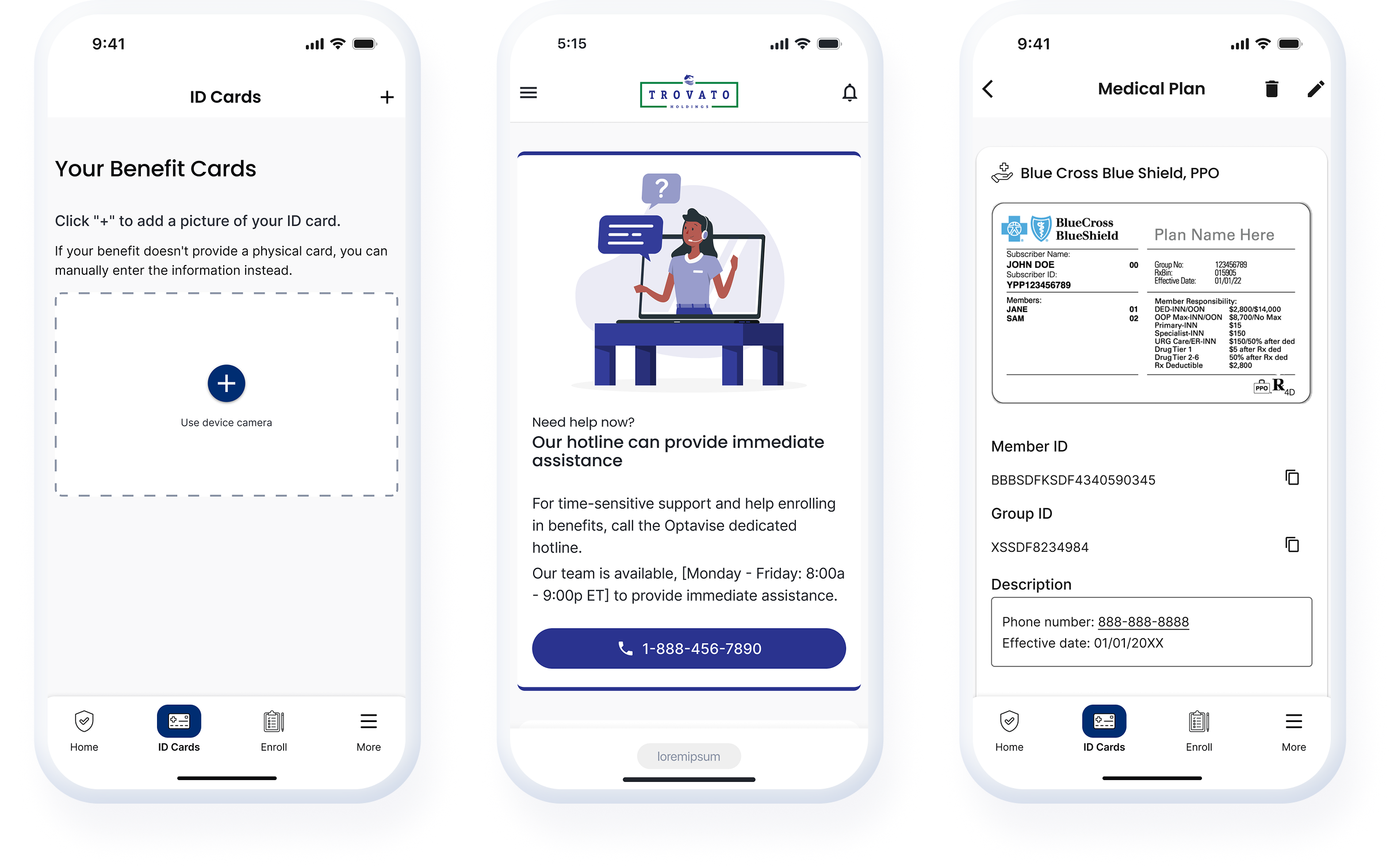
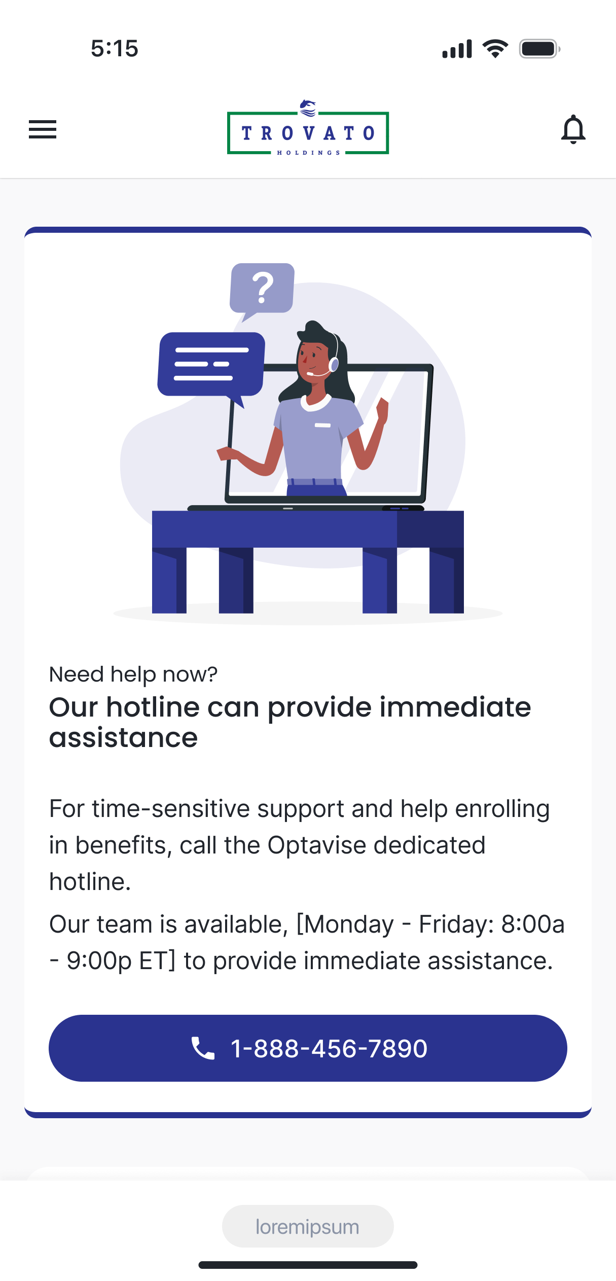
Give users quick access to benefits
The mobile app needed to let users get a quick overview of their benefits information: fast, glanceable, and without digging.

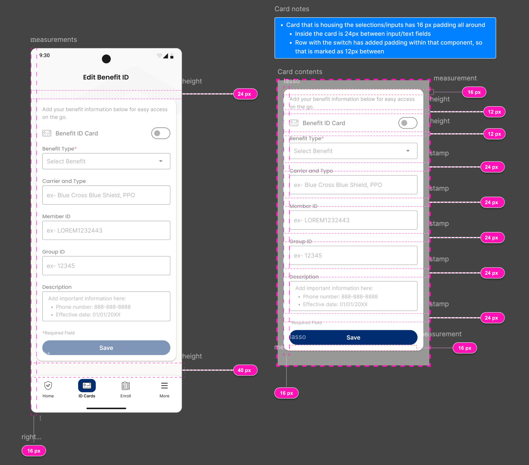
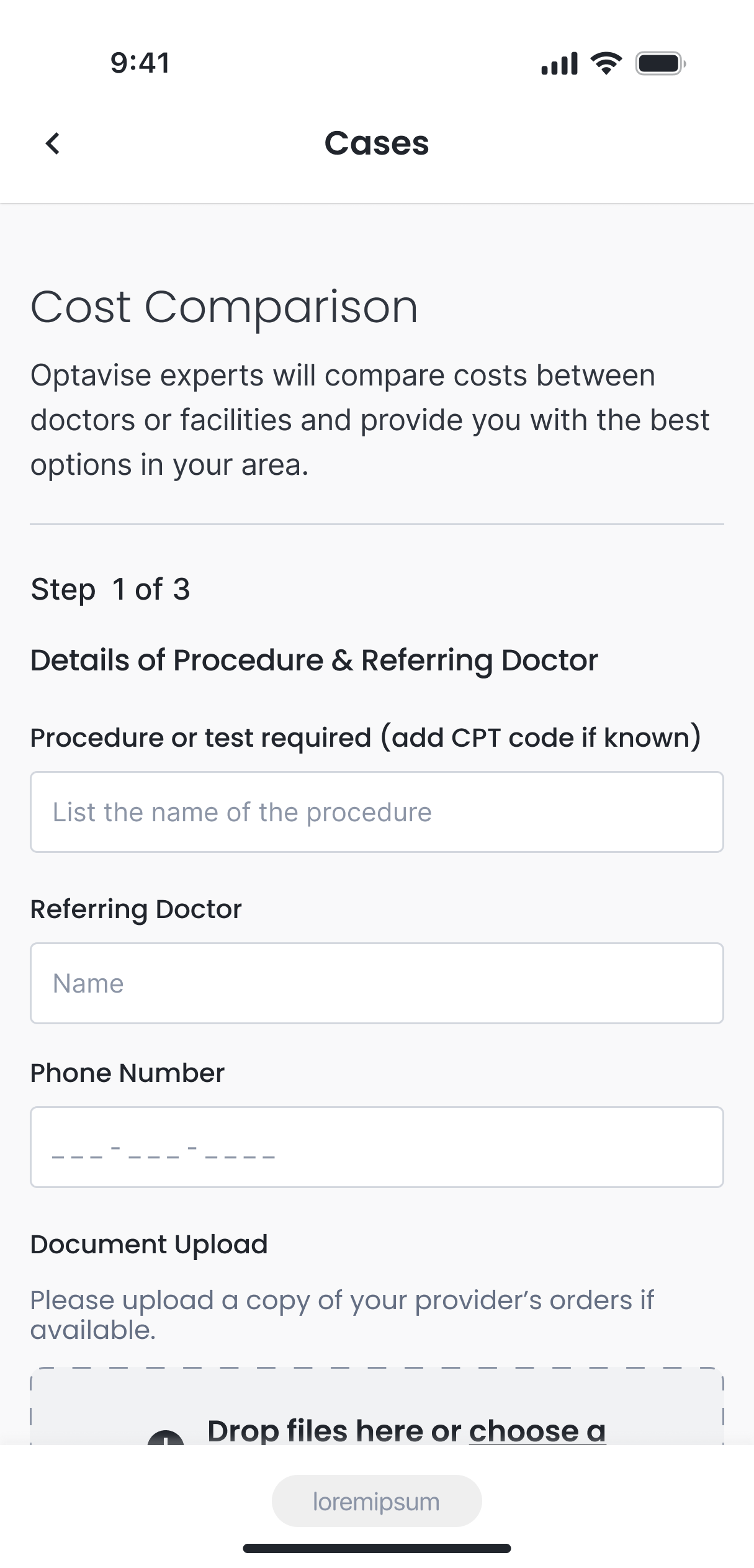
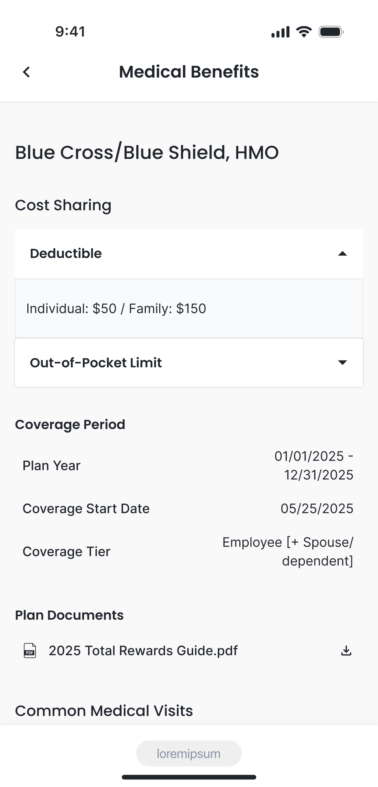
Developer handoff material
Legacy Infrastructure Problem
The app itself went through many iterations including whether it would be a native mobile app or a mobile browser app. The tricky problem was that the infrastructure of the benefit information and advocacy were at odds. Which resulted in some backend hurdles that ultimately, put the project on hold.
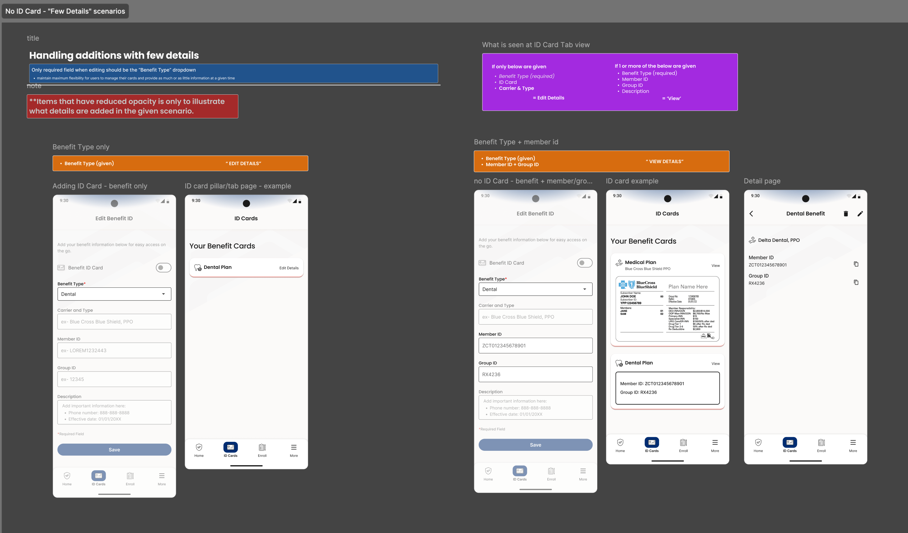
Mobile screens for different edge cases
Informed future delivered product
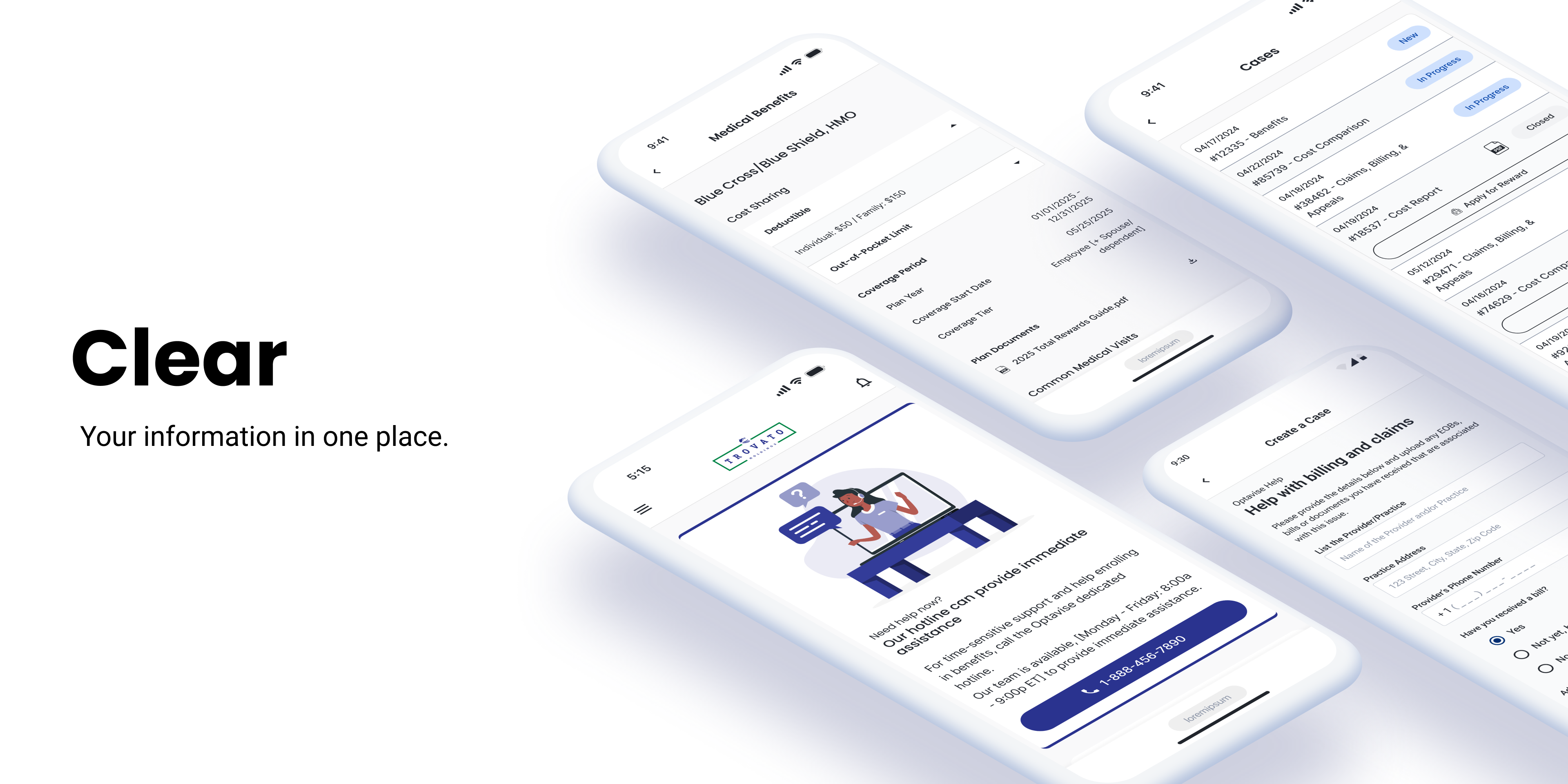
While the native app was put on hold, the research heavily informed the development of a new product called, ‘Clear.’
Native app became responsive site
While at the time it felt frustrating, the work that we did on the app laid the foundation for what would become the responsive site. The decision was appropriate for what the product’s function would be offering as it overlapped with another product that we already offered. It had become a “let’s have an app” just to “have an app.”

