Travel Companion Clarity
A custom feature on Spirit’s employee benefits page to reflect the airline’s updated travel companion policy and enhance overall user experience.
Role:
Lead designer collaborating with PM and engineers on the enrollment experience redesign
Timeline:
3 months; 2024
Tools:
Figma
Context
Spirit Airlines needed to accommodate a new 'Spirit Companion' tier for travel benefits—allowing employees to designate people/friends without submitting additional documentation. But the system already had Spouse and Parent categories with different approval rules.
Outcome
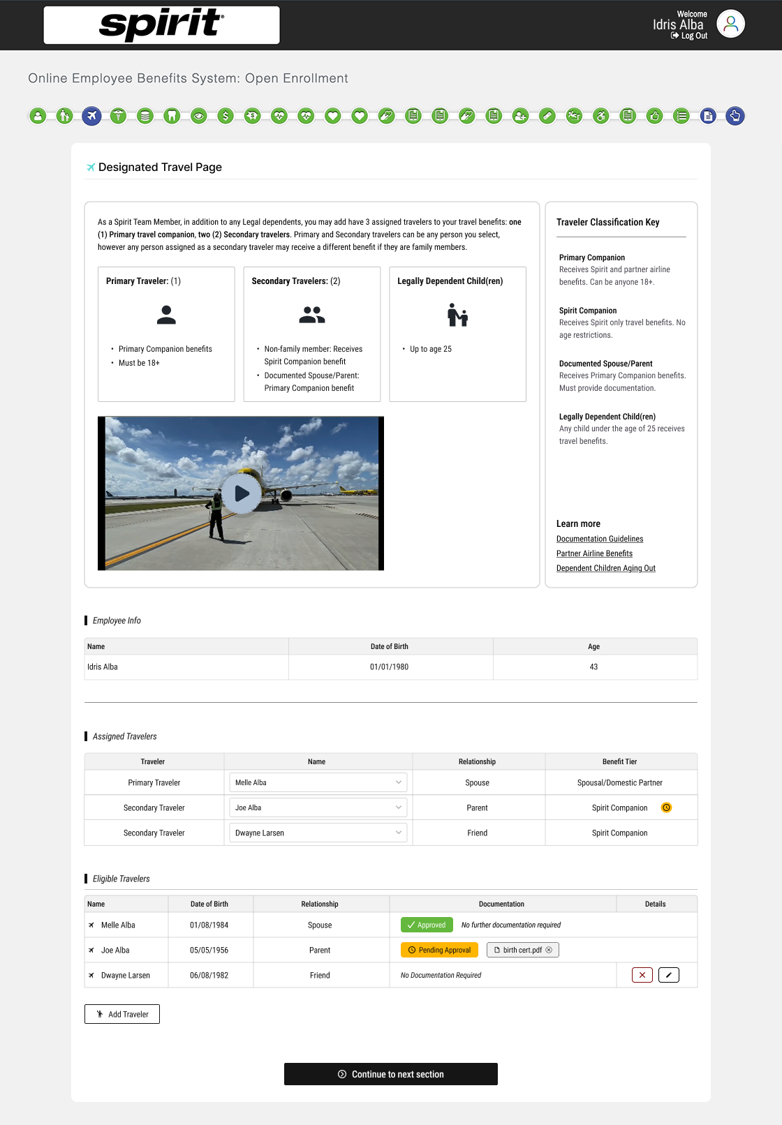
Implemented my designs and information hierarchy changes. I created a tiered information system: show eligibility rules upfront, keep a reference sidebar visible, provide detailed policy on-demand. This manifested as exposing what the travel benefits were up front and defining relationships that could/not be assigned to these tiers. Status markers related more specific information back to the user in how to move forward (if anything else was needed). Spirit adopted the changes, reducing enrollment friction and support tickets.

Problem
- Users couldn't see eligibility rules or documentation requirements upfront—only discovered them after submitting forms
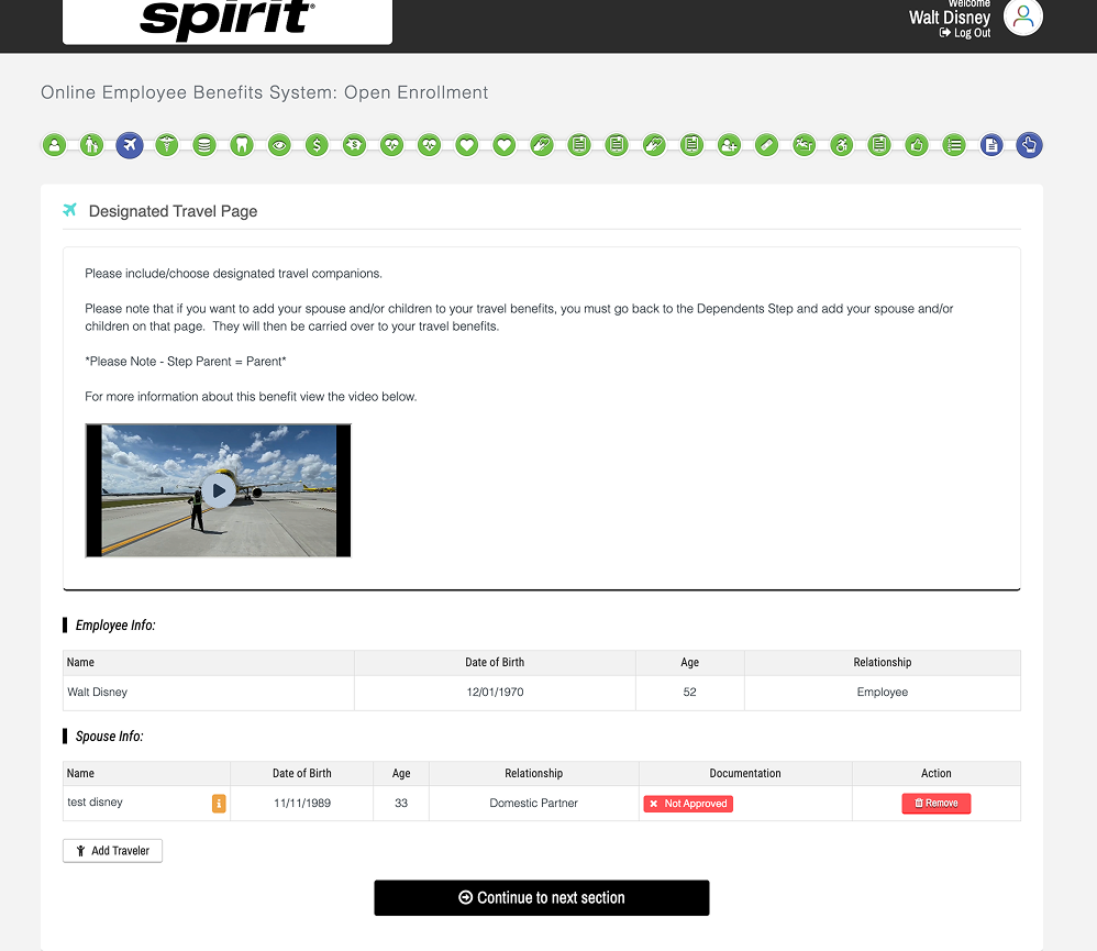
- "Not Approved" status was ambiguous. Was it rejected? Pending? What now?
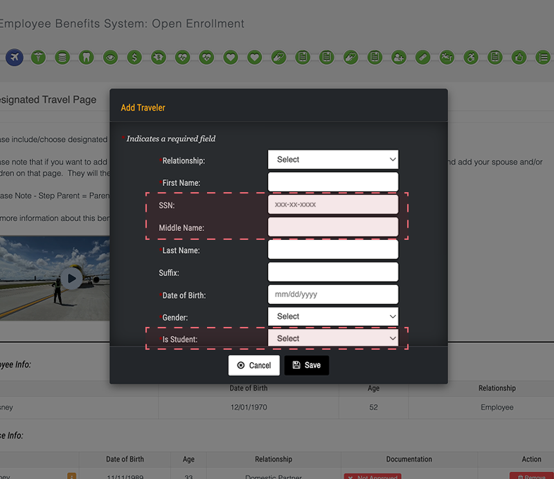
- Form asked for unnecessary data (SSN, Gender, Student Status) from everyone, even though only parents needed documentation
- Adding a third benefit tier (Spirit Companion) exposed that the system had no clear way to communicate different approval workflows
Solution
I restructured the information hierarchy into three layers: show eligibility rules upfront, keep a reference sidebar visible, provide detailed policy on-demand.
Delivered product
Progressive Disclosure
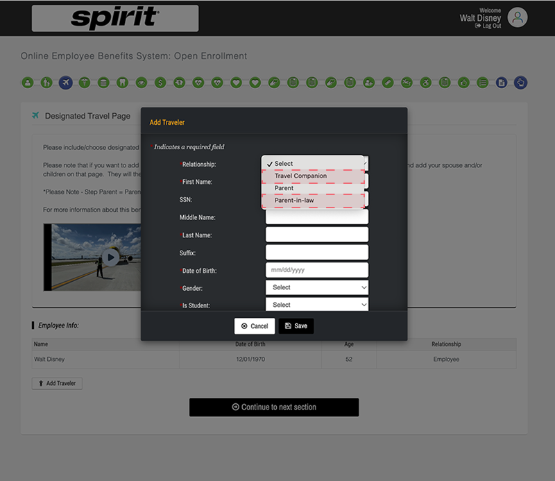
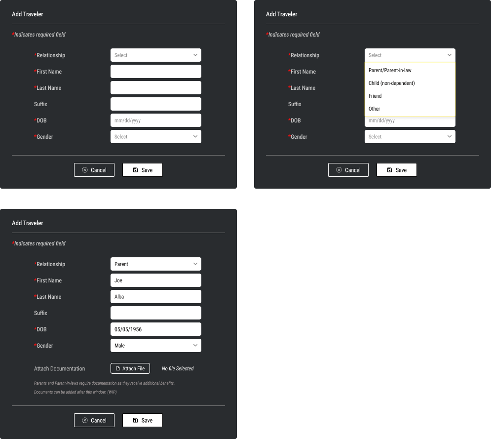
What changed: The "Add Traveler" dialog now shows only the fields relevant to the selected relationship type.
- Old: All users saw SSN, Gender, Student Status fields → unnecessary data collection → security bloat
- New: Select relationship first → only ask for fields that matter for that relationship (e.g., file upload only appears for parents (spouse would’ve been added in an earlier step))
Code side: Relationship selection triggers conditional form rendering. Backend eligibility rules determine which fields are required, reducing validation errors and data bloat.
Transparent Approval Status
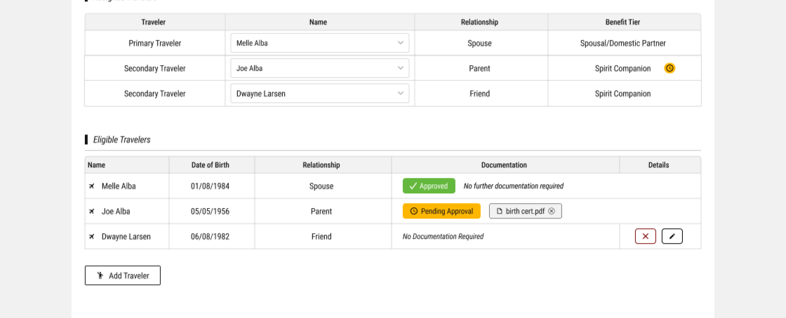
What changed: Replaced "Not Approved" with explicit status badges + context.
- Old: "Not Approved" → user confusion (rejected? pending? what now?)
- New: Green badge "Approved" + Amber badge "Pending Approval" + tooltip explaining next steps.
Code side: Frontend maps backend approval state (approved, pending, rejected, waived) to human-readable status + actionable next steps. Users know exactly where things stand.
Persistent Reference Key
What changed: Added a "Traveler Classification Key" that's visible during enrollment. Users see what each tier offers without hunting for a modal or video.
- Old: Eligibility rules scattered in video → users discovered rules after submitting
- New: Key sits beside the main information → users reference it while making choices
Code side: Sidebar displays eligibility data from the same backend source as the form logic, ensuring consistency across all three systems (dialog, sidebar, status table).
Concept
Legacy Approach
New Approach
Travel benefit tiers
Unclear that there are any
Explained tiers; user assigns
Adding Traveler
Mixed concepts/unclear verbiage
Clear communication; match mental model
Status Clarity
“Not Approved” (ambiguous)
Green/Amber badge + specific reason + what happens next
Data Entry
9 fields for everyone
Contextual; only fields that matter for this relationship
Changes to Companions
No saved companions from previous years = data reentry
Added section of individuals that
Impact
- Employees no longer discover rules after submitting forms
- Form feels less overwhelming (only relevant questions asked)
- Approval status is transparent and actionable
- Reference material is always available, reducing support tickets

